Vibepro
Visual Identity & Logo
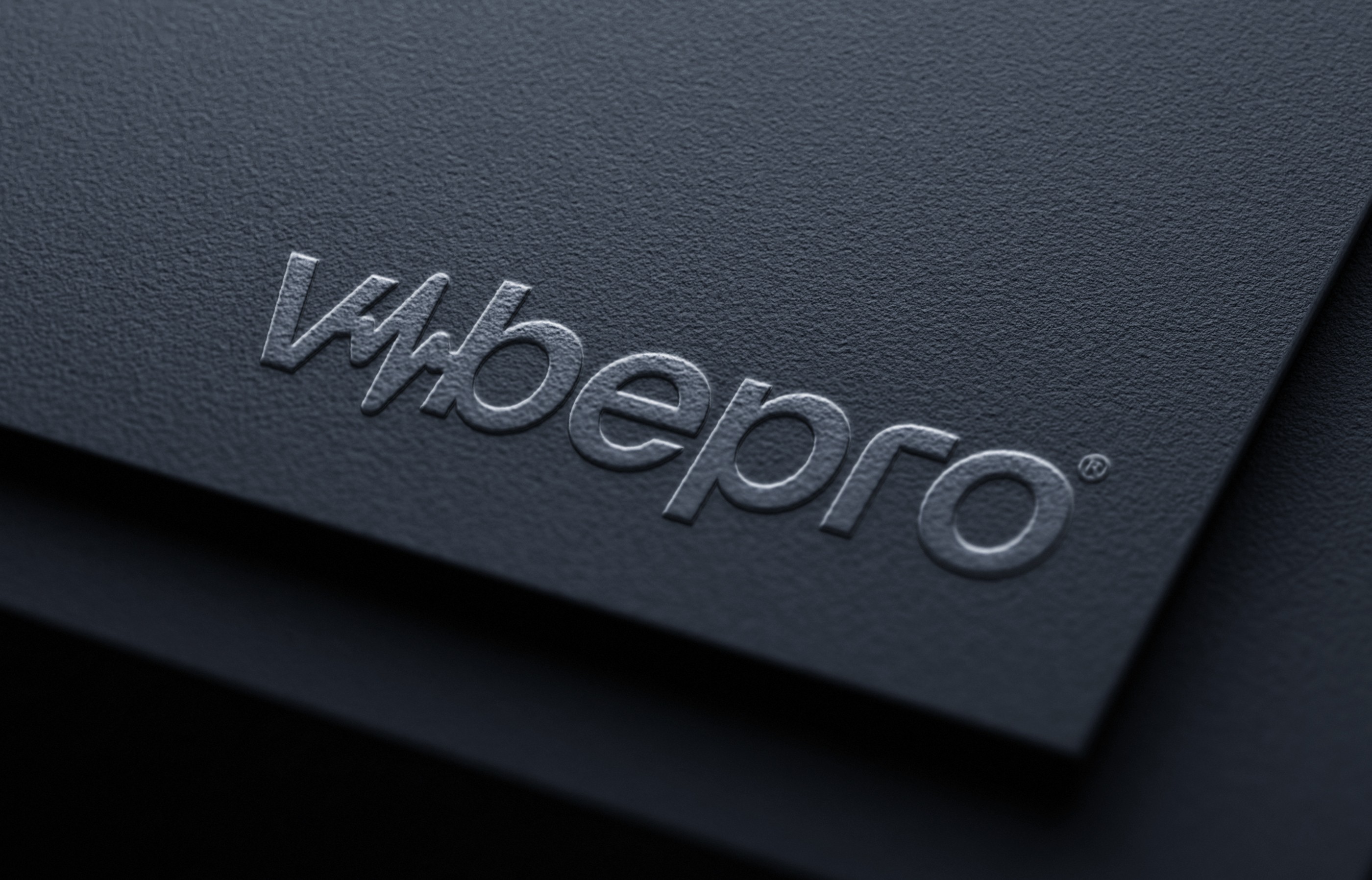
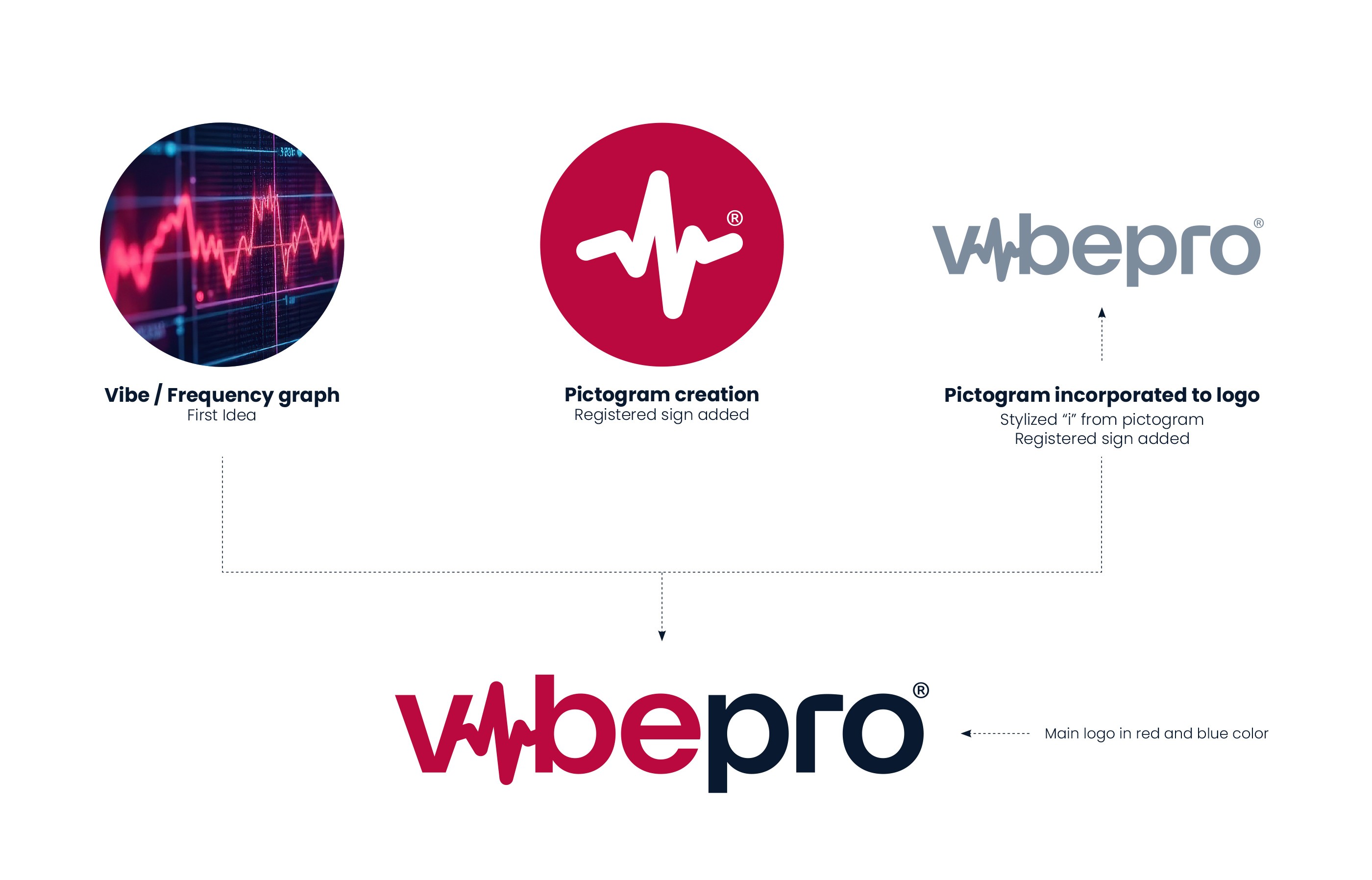
When an existing client, SETCO, approached me to create the corporate identity for their new subsidiary, VibePro, I was thrilled. From the very beginning, I felt there was immense potential to develop a truly beautiful and functional identity. As the central element, I designed a logotype featuring a distinctive stylized letter "i" shaped like a frequency wave. I then utilized this element as a standalone pictogram across other applications.
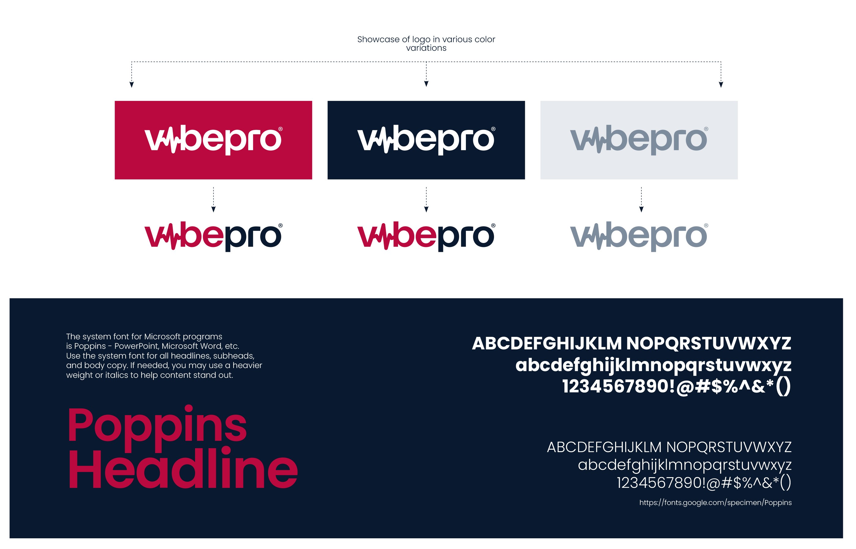
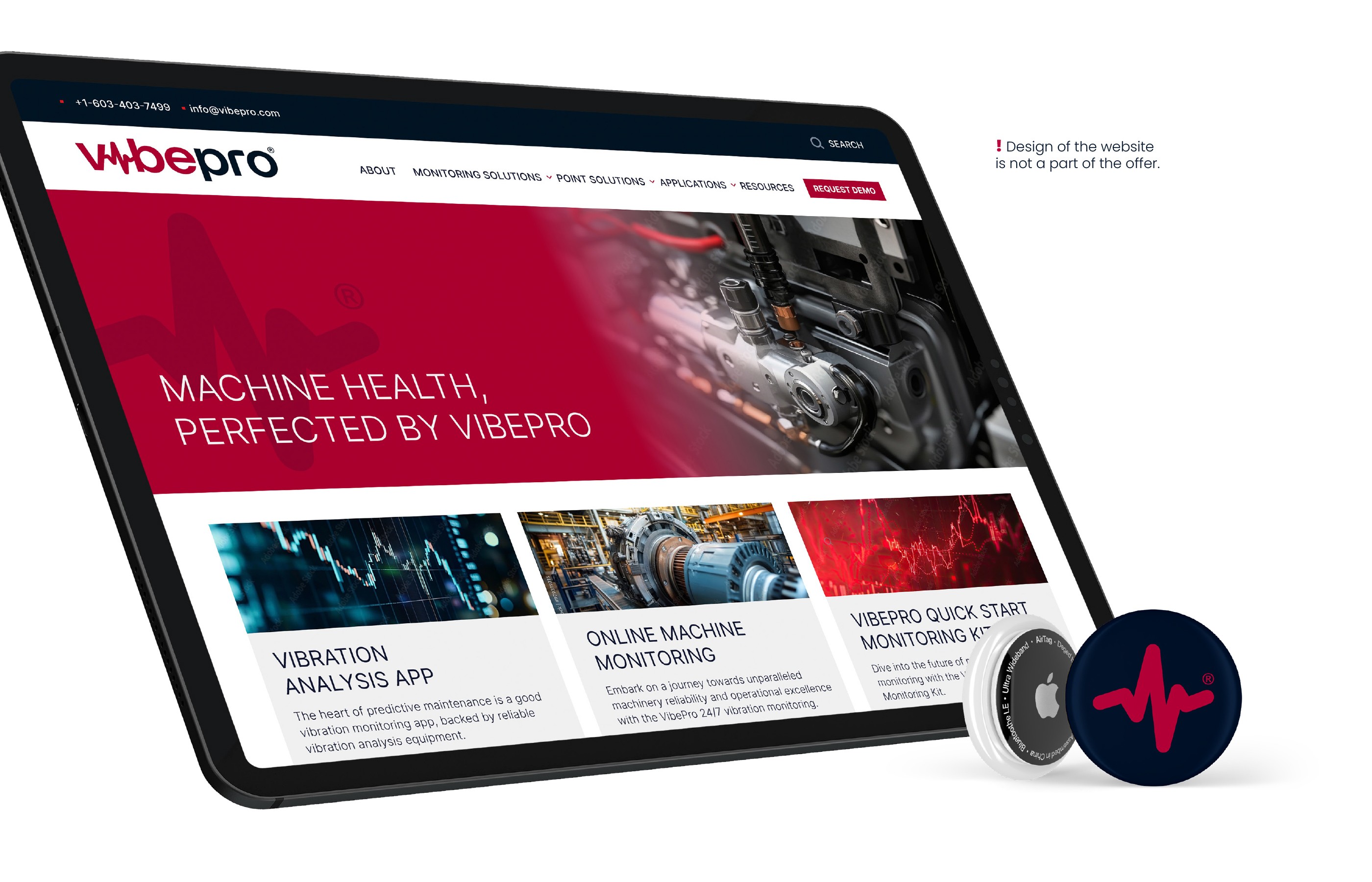
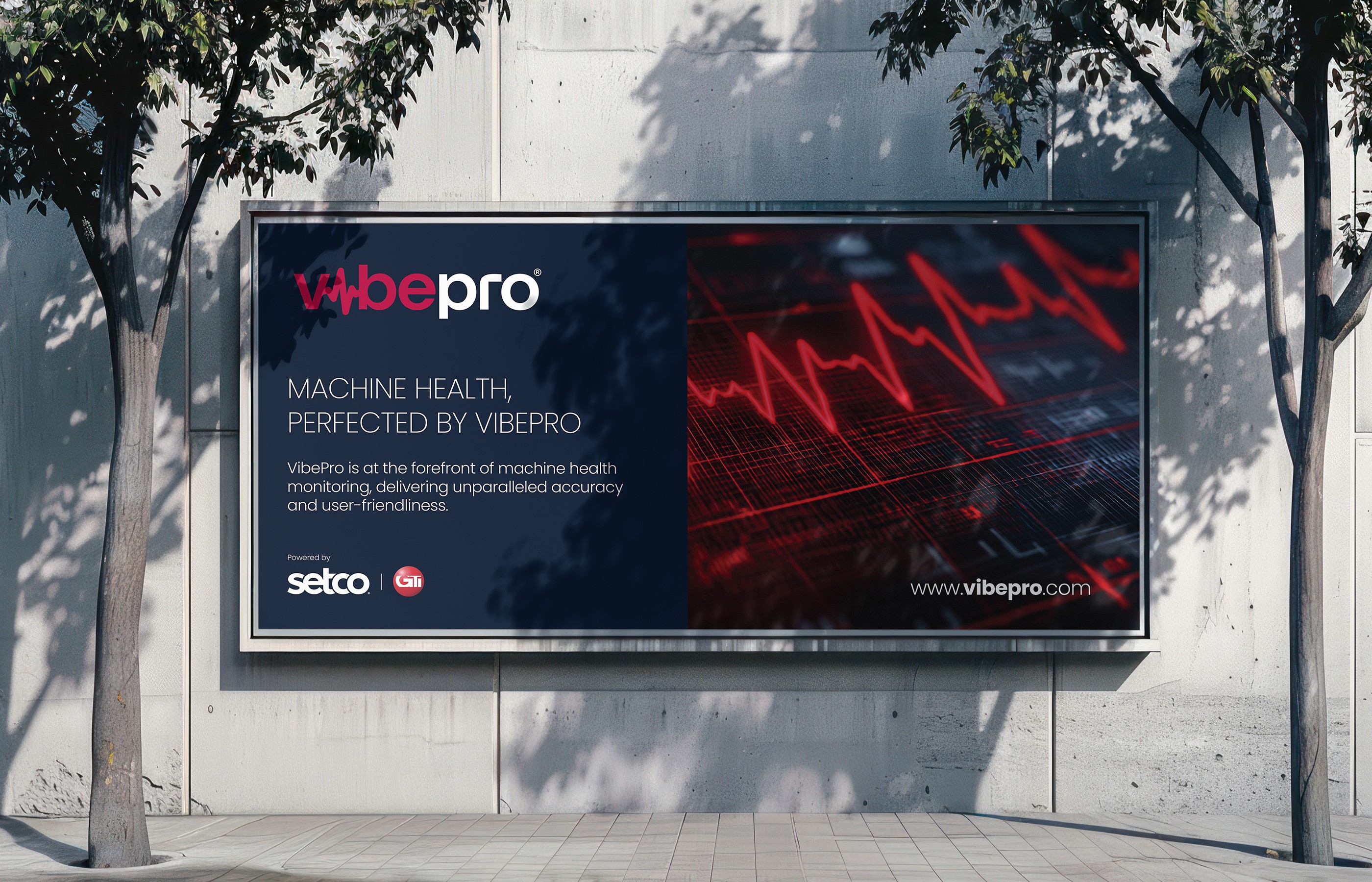
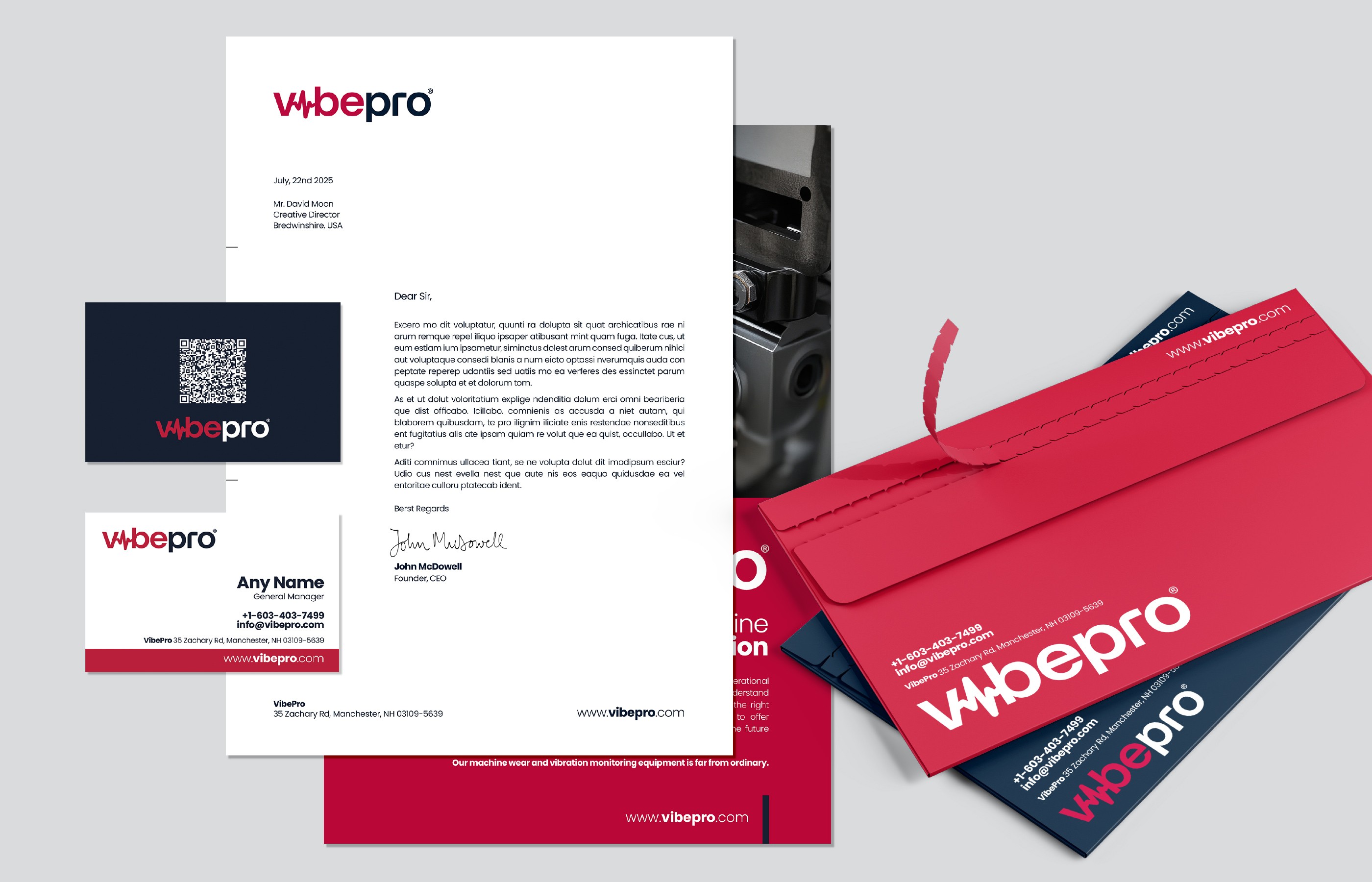
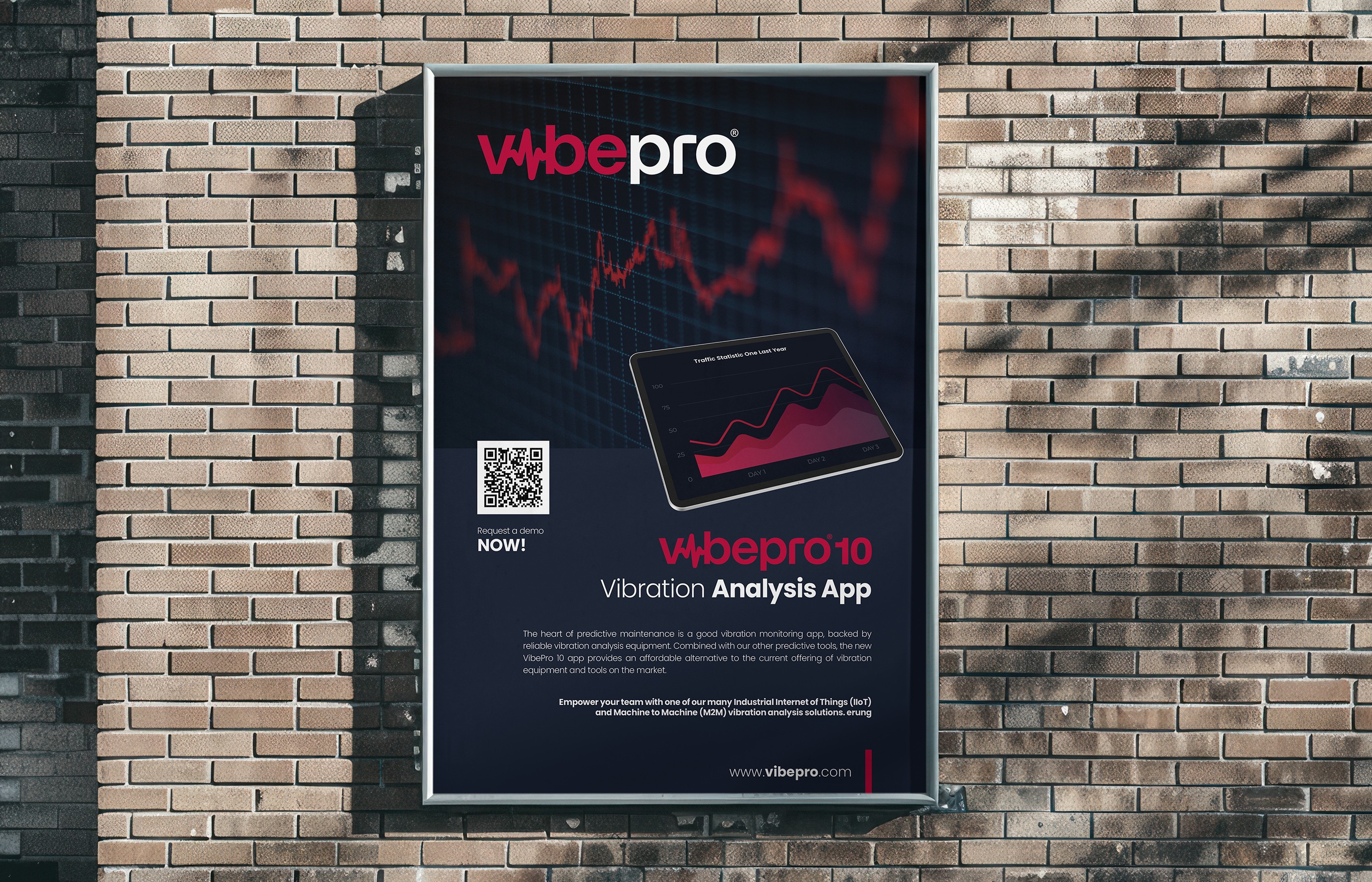
The chosen color palette, typography, and especially the extensive library of stock and lifestyle photography further underscore the identity's versatility and usability across all marketing materials. As part of the deliverables, I created the brand guidelines manual and designs for essential stationery, such as business cards, letterheads, posters, and even a billboard.
When an existing client, SETCO, approached me to create the corporate identity for their new subsidiary, VibePro, I was thrilled. From the very beginning, I felt there was immense potential to develop a truly beautiful and functional identity. As the central element, I designed a logotype featuring a distinctive stylized letter "i" shaped like a frequency wave. I then utilized this element as a standalone pictogram across other applications.
The chosen color palette, typography, and especially the extensive library of stock and lifestyle photography further underscore the identity's versatility and usability across all marketing materials. As part of the deliverables, I created the brand guidelines manual and designs for essential stationery, such as business cards, letterheads, posters, and even a billboard.
When an existing client, SETCO, approached me to create the corporate identity for their new subsidiary, VibePro, I was thrilled. From the very beginning, I felt there was immense potential to develop a truly beautiful and functional identity. As the central element, I designed a logotype featuring a distinctive stylized letter "i" shaped like a frequency wave. I then utilized this element as a standalone pictogram across other applications.
The chosen color palette, typography, and especially the extensive library of stock and lifestyle photography further underscore the identity's versatility and usability across all marketing materials. As part of the deliverables, I created the brand guidelines manual and designs for essential stationery, such as business cards, letterheads, posters, and even a billboard.