Kitchen Mart
Brand Identity & Visual System
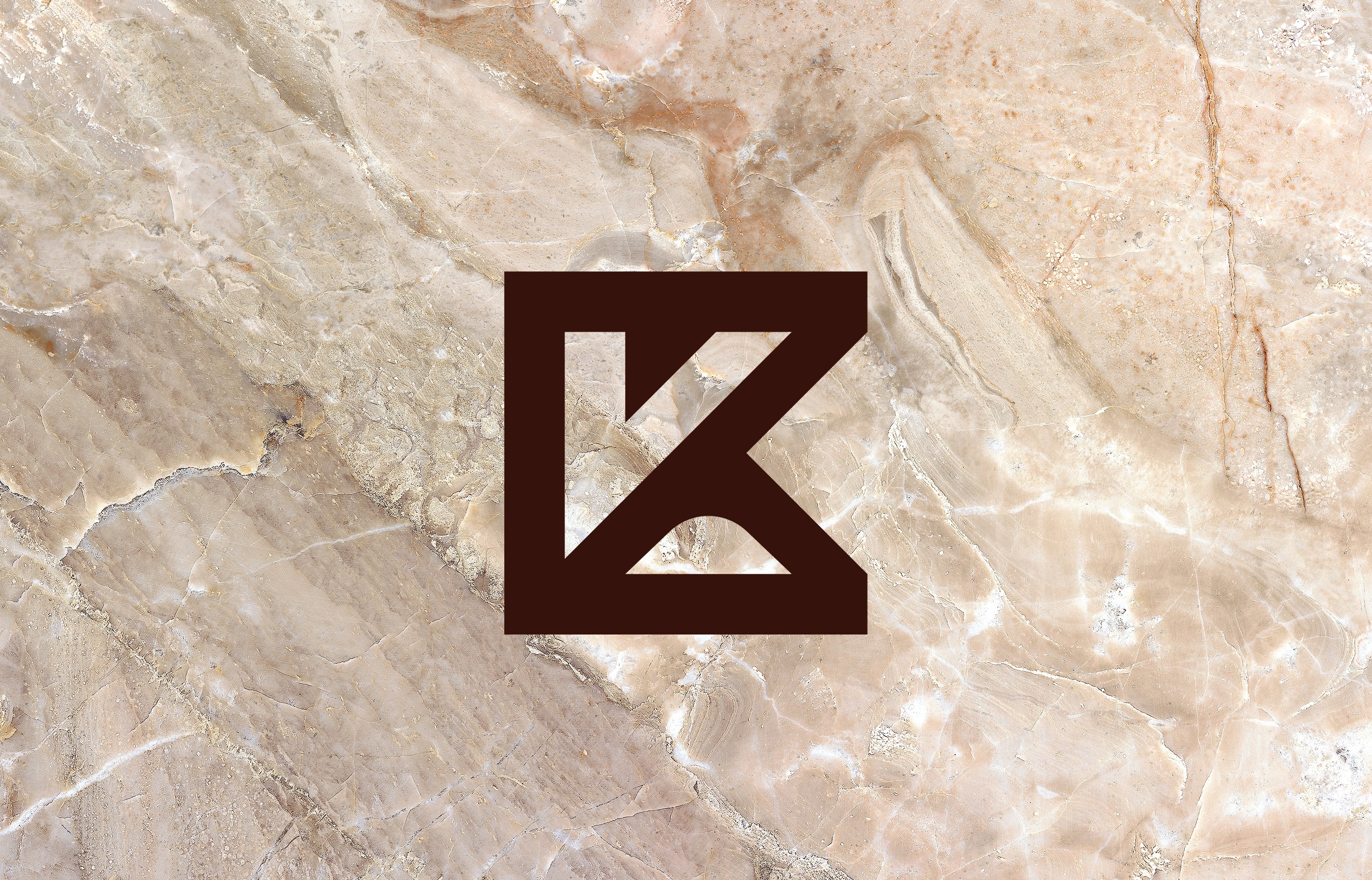
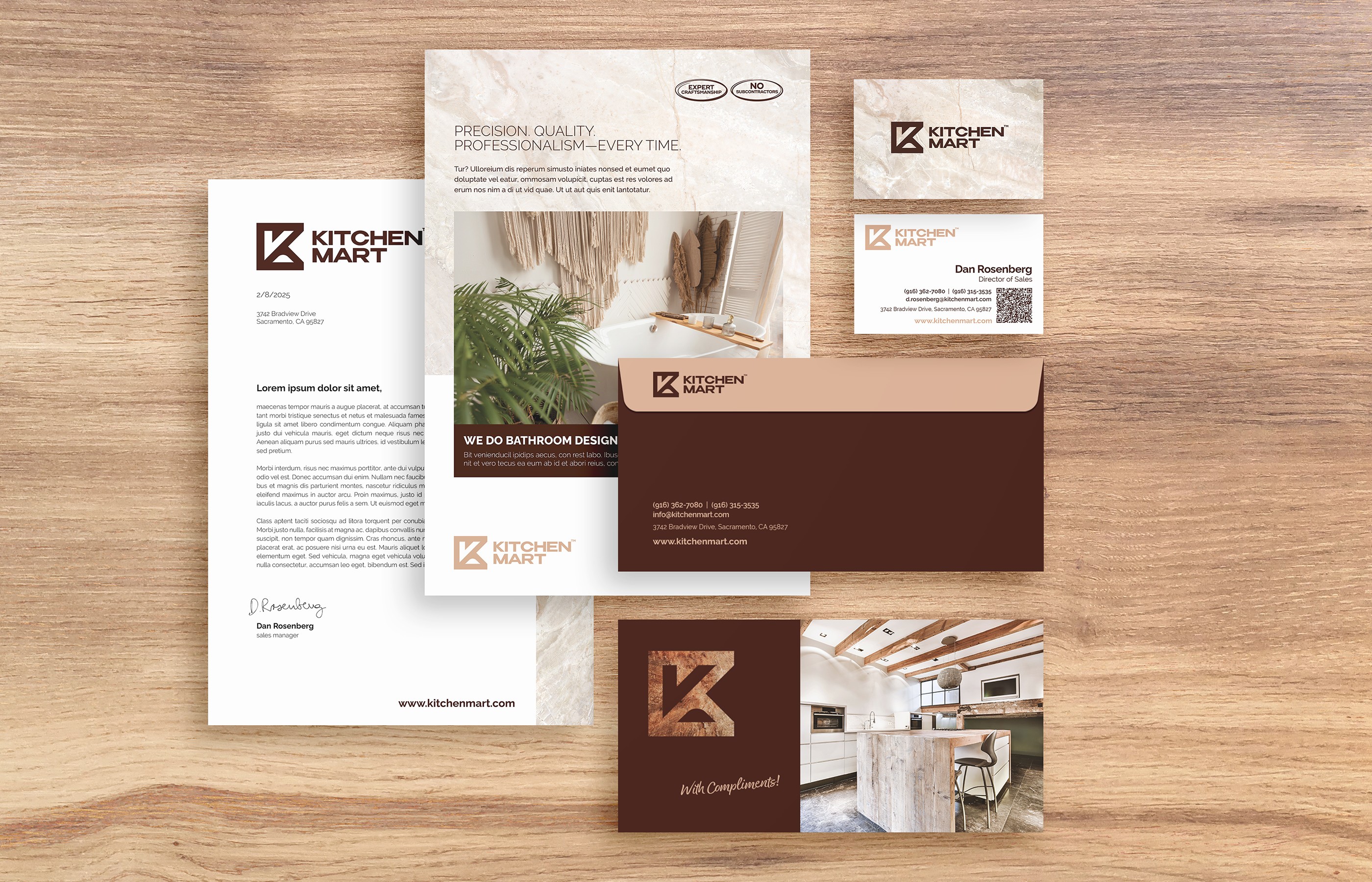
When I started working on the print materials for a kitchen and bathroom renovation company based in Sacramento, California, the firm was still using its original logo and a fixed color palette. However, the logo was outdated, and the chosen colors did not align with the industry. Therefore, during the rebranding process, I focused not only on the new logo but also on the overall visual identity to better support the company's business activities. The core of the system is a bold geometric pictogram combining the letter K and a rotated letter M. The visual identity is further complemented by a warm palette of espresso brown and stone beige, along with natural stone textures that convey quality and craftsmanship.
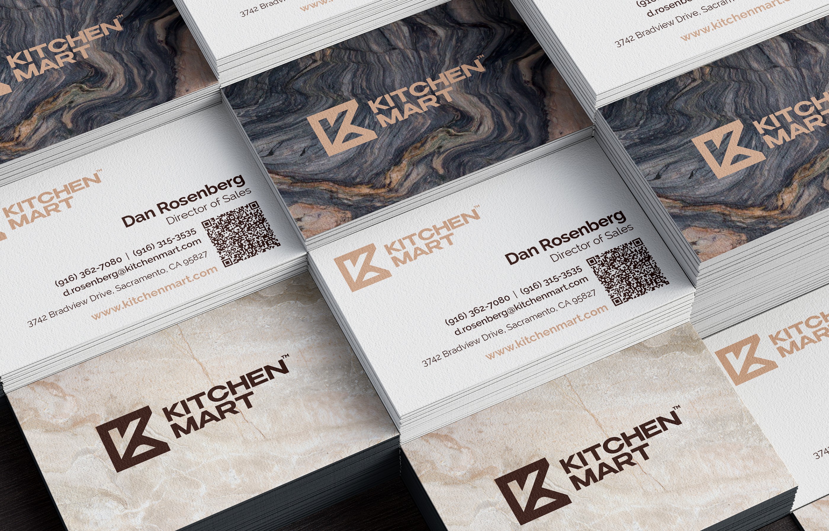
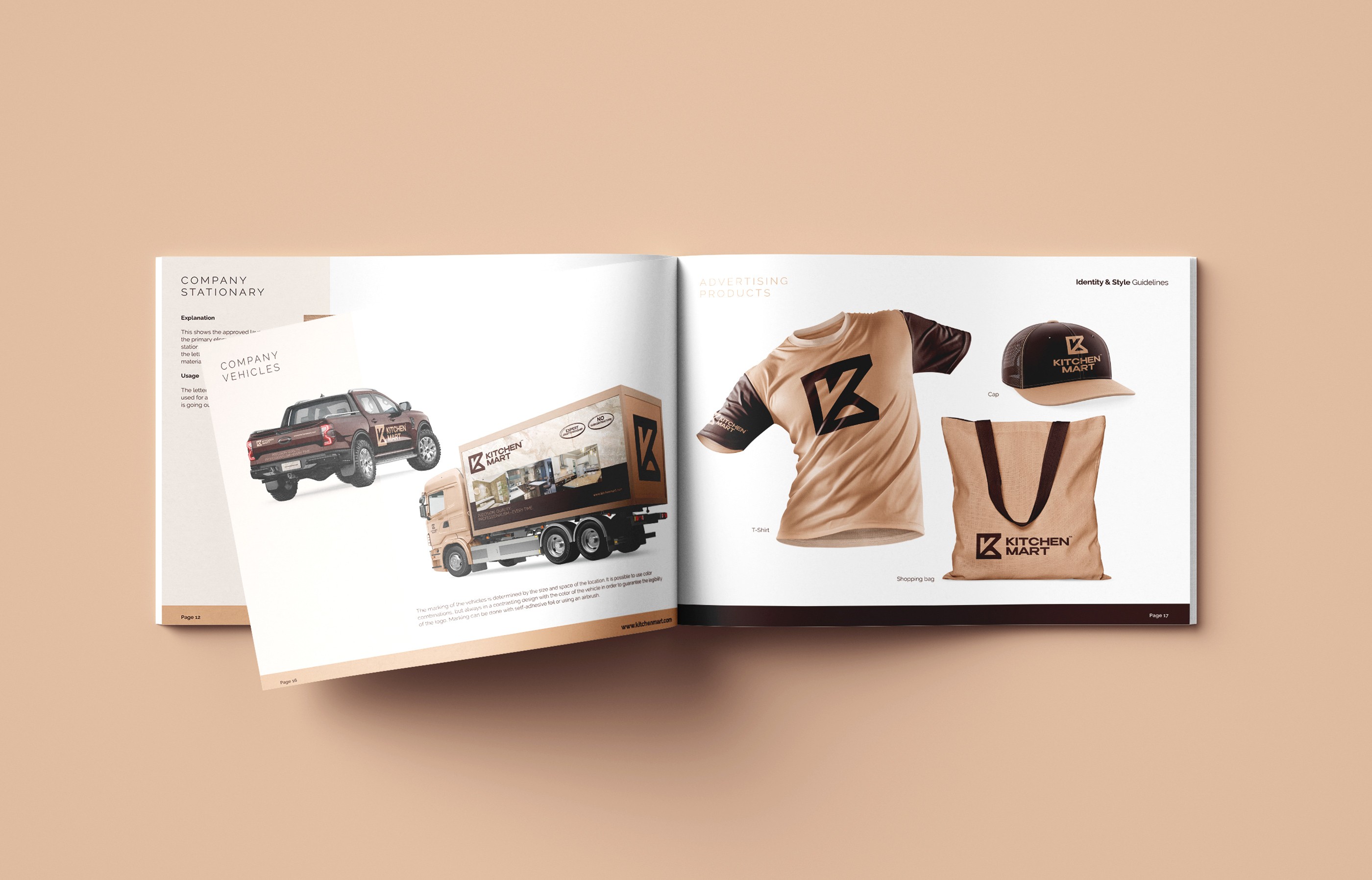
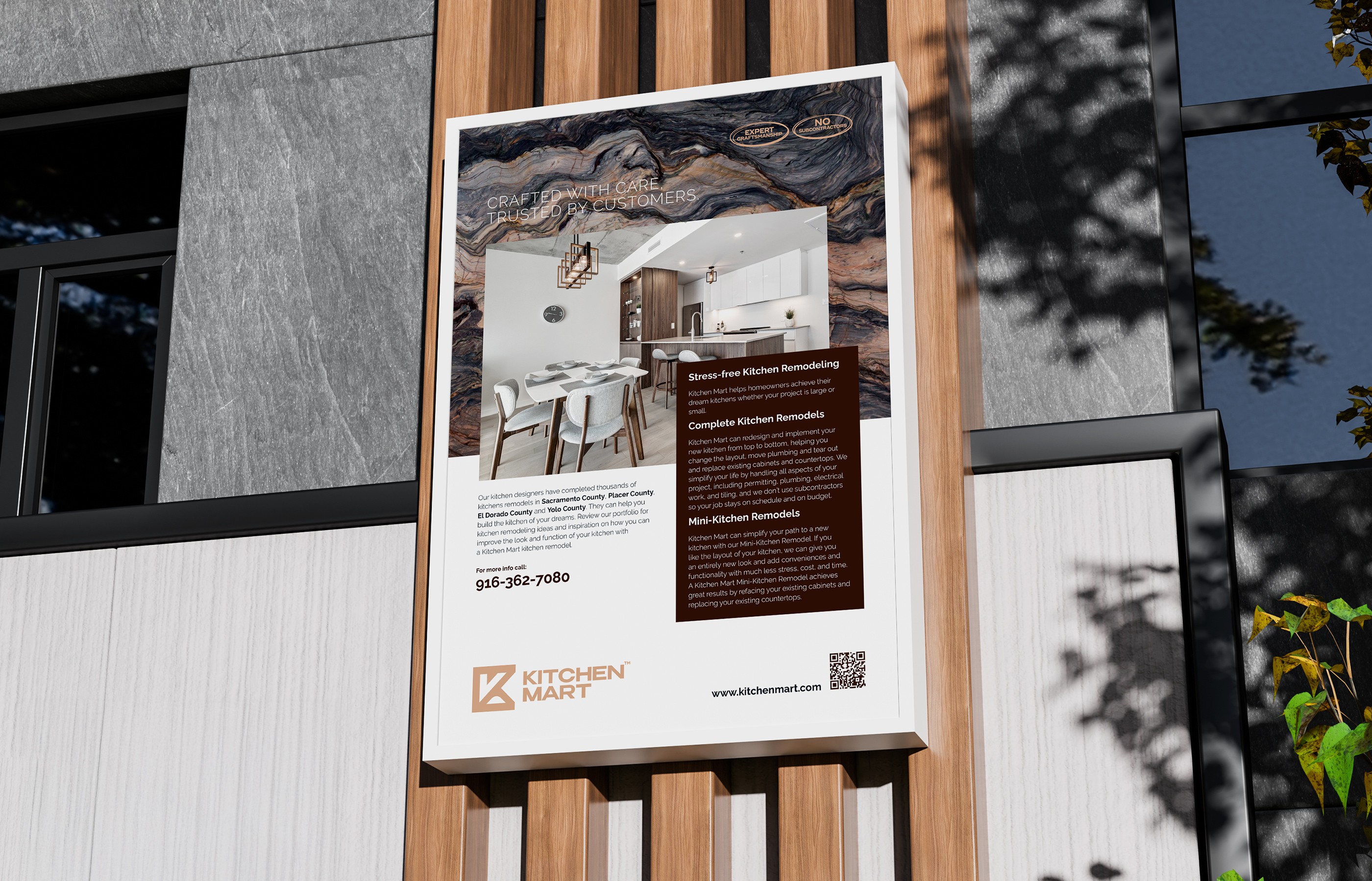
Výstupy pokrývají všechny kontaktní body značky – od firemních tiskovin a vizitek přes polepy vozidel a outdoorovou reklamu až po digitální UI návrhy webu a aplikace – přičemž je všude zachován konzistentní vizuální jazyk. Součástí dodávky bylo vytvoření rozsáhlé fotobanky, která umožňuje do budoucna tvorbu řady reklamních materiálů a případových studií.



When I started working on the print materials for a kitchen and bathroom renovation company based in Sacramento, California, the firm was still using its original logo and a fixed color palette. However, the logo was outdated, and the chosen colors did not align with the industry. Therefore, during the rebranding process, I focused not only on the new logo but also on the overall visual identity to better support the company's business activities. The core of the system is a bold geometric pictogram combining the letter K and a rotated letter M. The visual identity is further complemented by a warm palette of espresso brown and stone beige, along with natural stone textures that convey quality and craftsmanship.
Výstupy pokrývají všechny kontaktní body značky – od firemních tiskovin a vizitek přes polepy vozidel a outdoorovou reklamu až po digitální UI návrhy webu a aplikace – přičemž je všude zachován konzistentní vizuální jazyk. Součástí dodávky bylo vytvoření rozsáhlé fotobanky, která umožňuje do budoucna tvorbu řady reklamních materiálů a případových studií.
When I started working on the print materials for a kitchen and bathroom renovation company based in Sacramento, California, the firm was still using its original logo and a fixed color palette. However, the logo was outdated, and the chosen colors did not align with the industry. Therefore, during the rebranding process, I focused not only on the new logo but also on the overall visual identity to better support the company's business activities. The core of the system is a bold geometric pictogram combining the letter K and a rotated letter M. The visual identity is further complemented by a warm palette of espresso brown and stone beige, along with natural stone textures that convey quality and craftsmanship.
Výstupy pokrývají všechny kontaktní body značky – od firemních tiskovin a vizitek přes polepy vozidel a outdoorovou reklamu až po digitální UI návrhy webu a aplikace – přičemž je všude zachován konzistentní vizuální jazyk. Součástí dodávky bylo vytvoření rozsáhlé fotobanky, která umožňuje do budoucna tvorbu řady reklamních materiálů a případových studií.