Flipkart
Flipkart — Brand Identity & Multi-Category Visual System
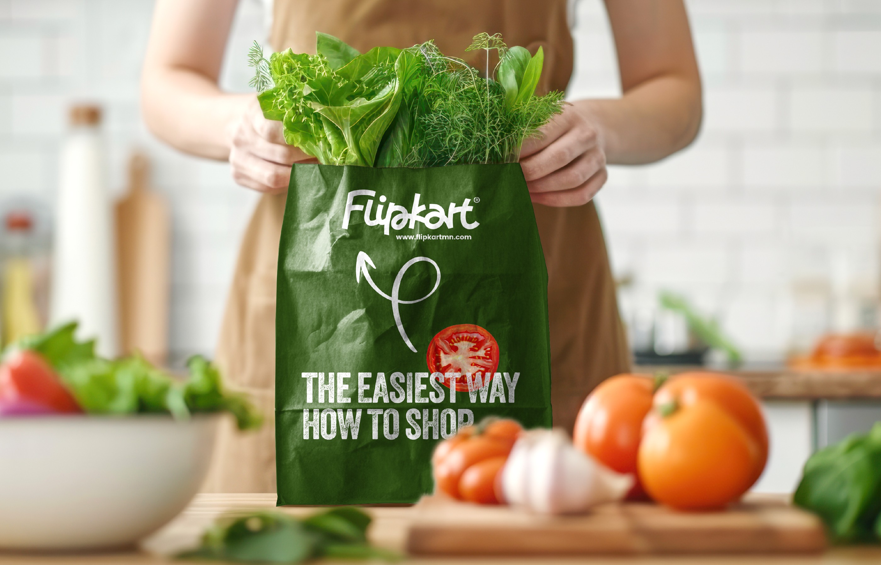
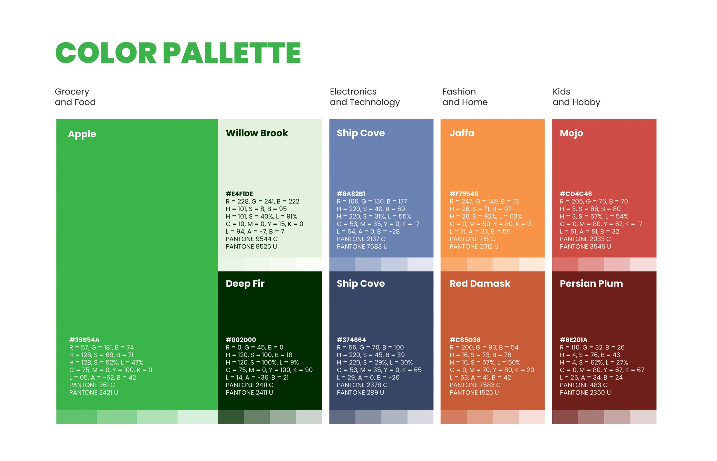
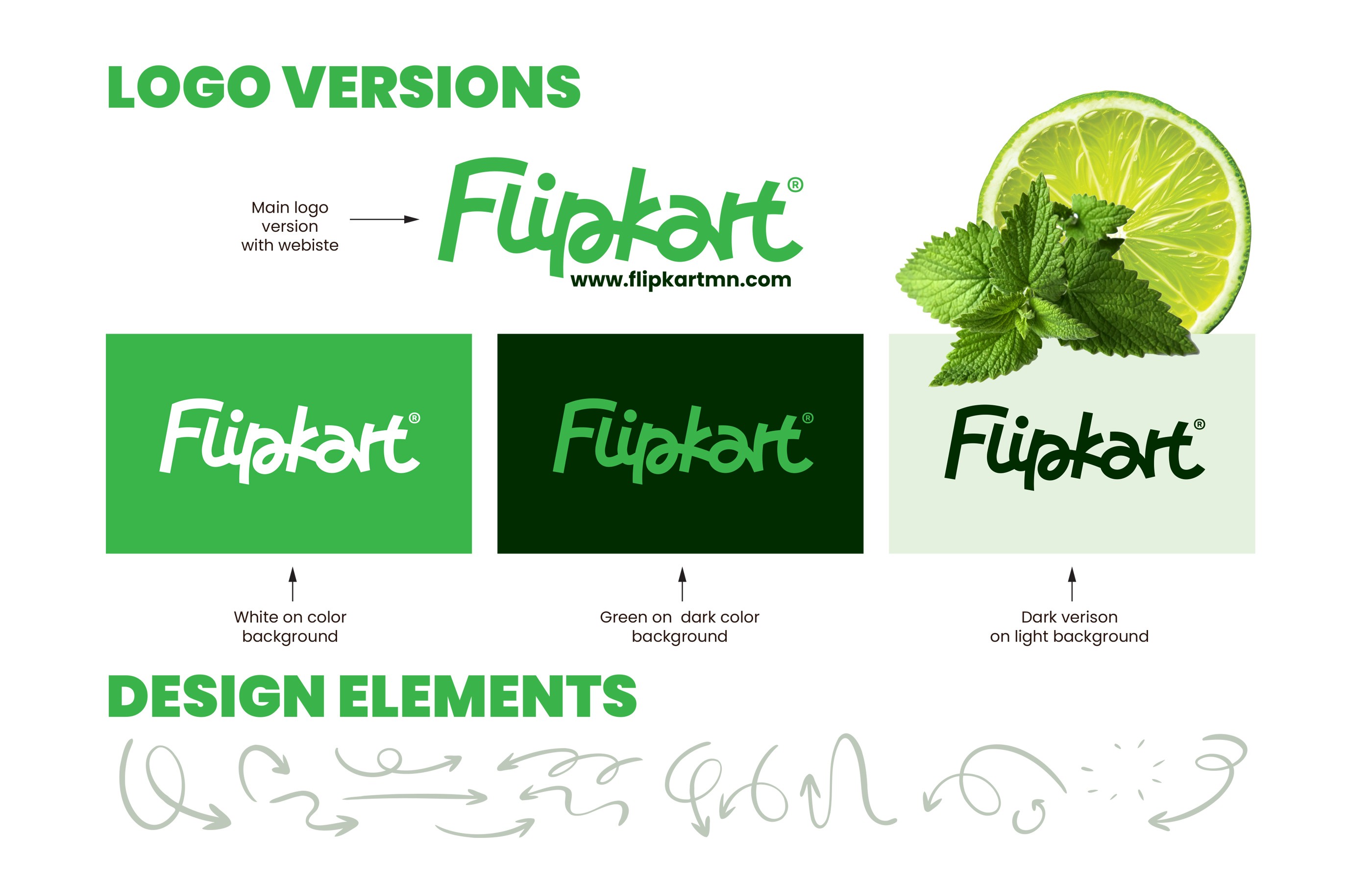
Working for the American startup Flipkart - an online marketplace covering groceries, electronics, fashion, and more - was both a big challenge and a lot of fun. At the core of the system is a custom hand-drawn logotype, designed to work seamlessly alongside a color system that spans across categories. Each product section has its own distinct color, and the logo must form a cohesive unit with each one. The entire visual language is accompanied by hand-drawn arrow motifs that tie everything together visually and point to the individual products that need to be highlighted in campaigns.
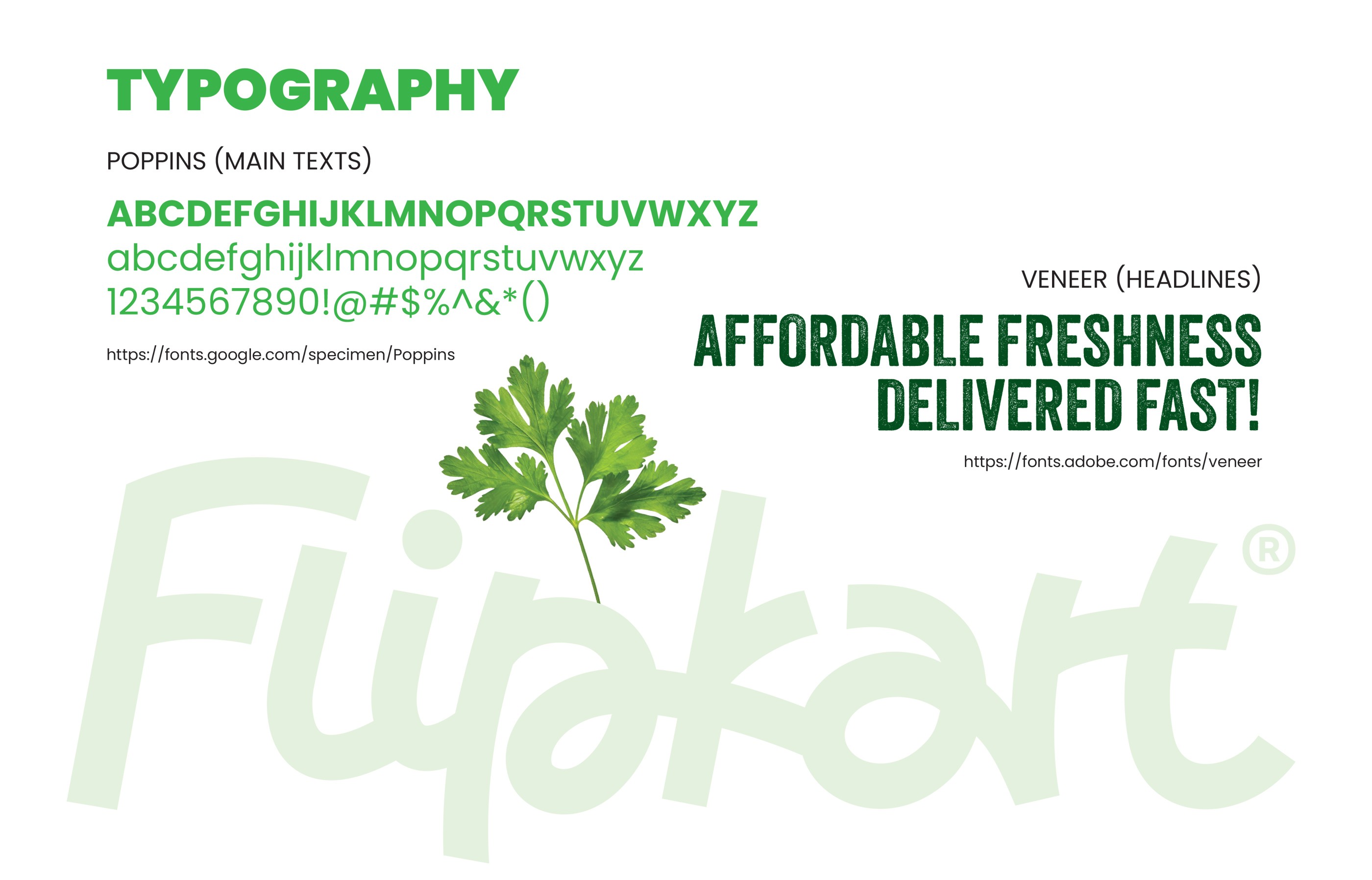
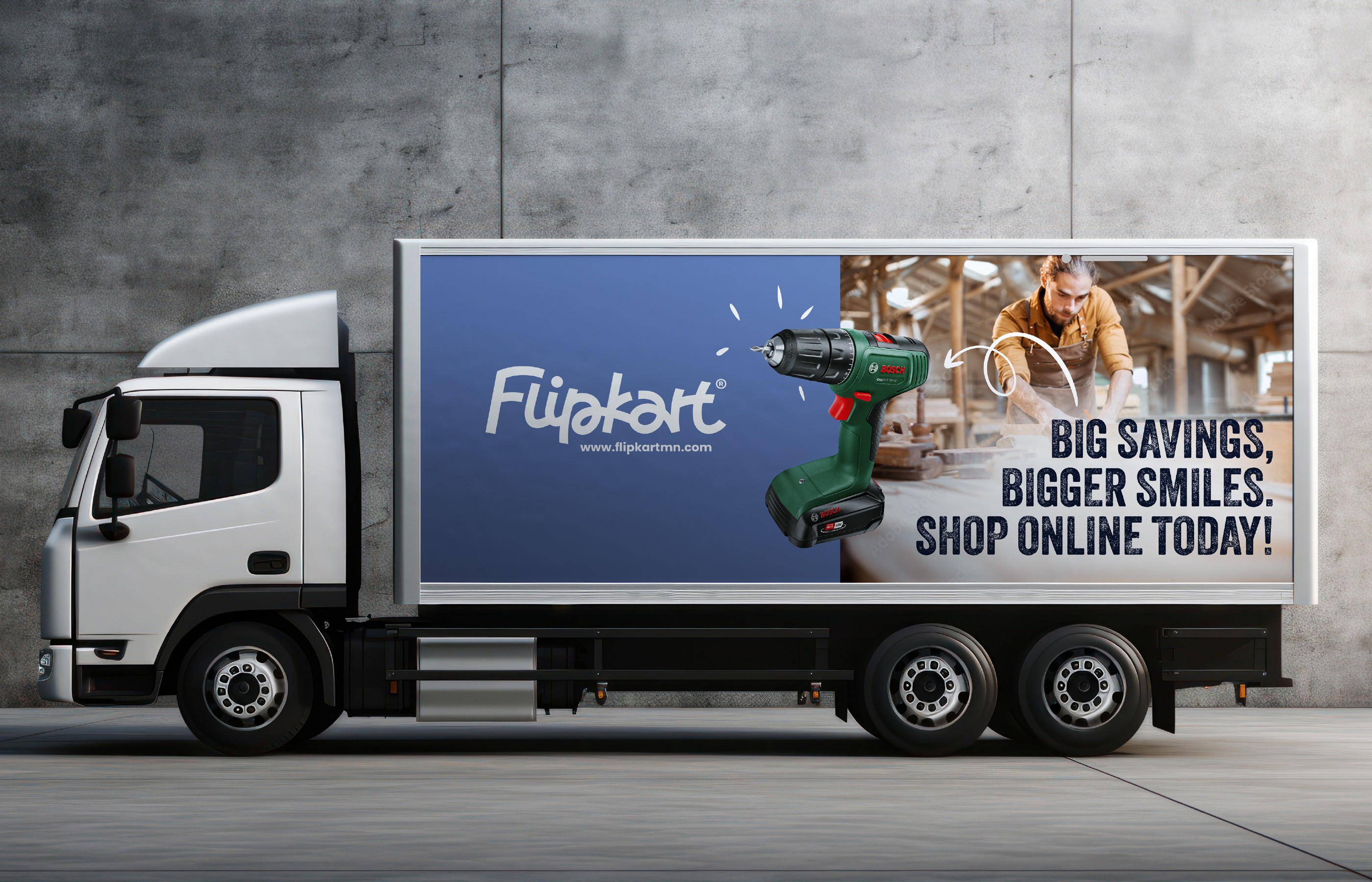
Poppins handles body copy while the textured Veneer typeface drives campaign headlines. Deliverables span brand guidelines, packaging, vehicle wraps, outdoor advertising, and digital UI mockups for web and mobile.
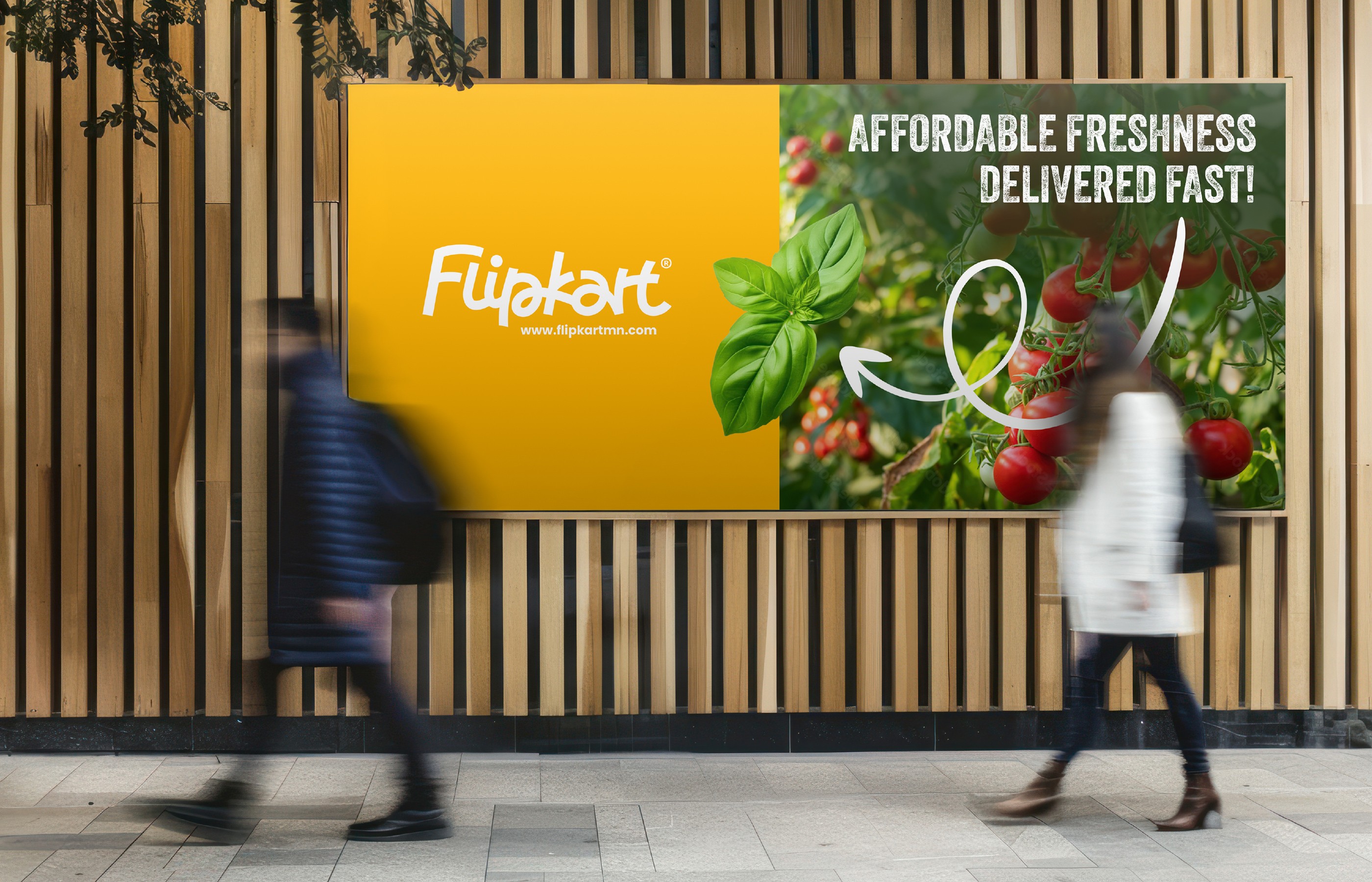

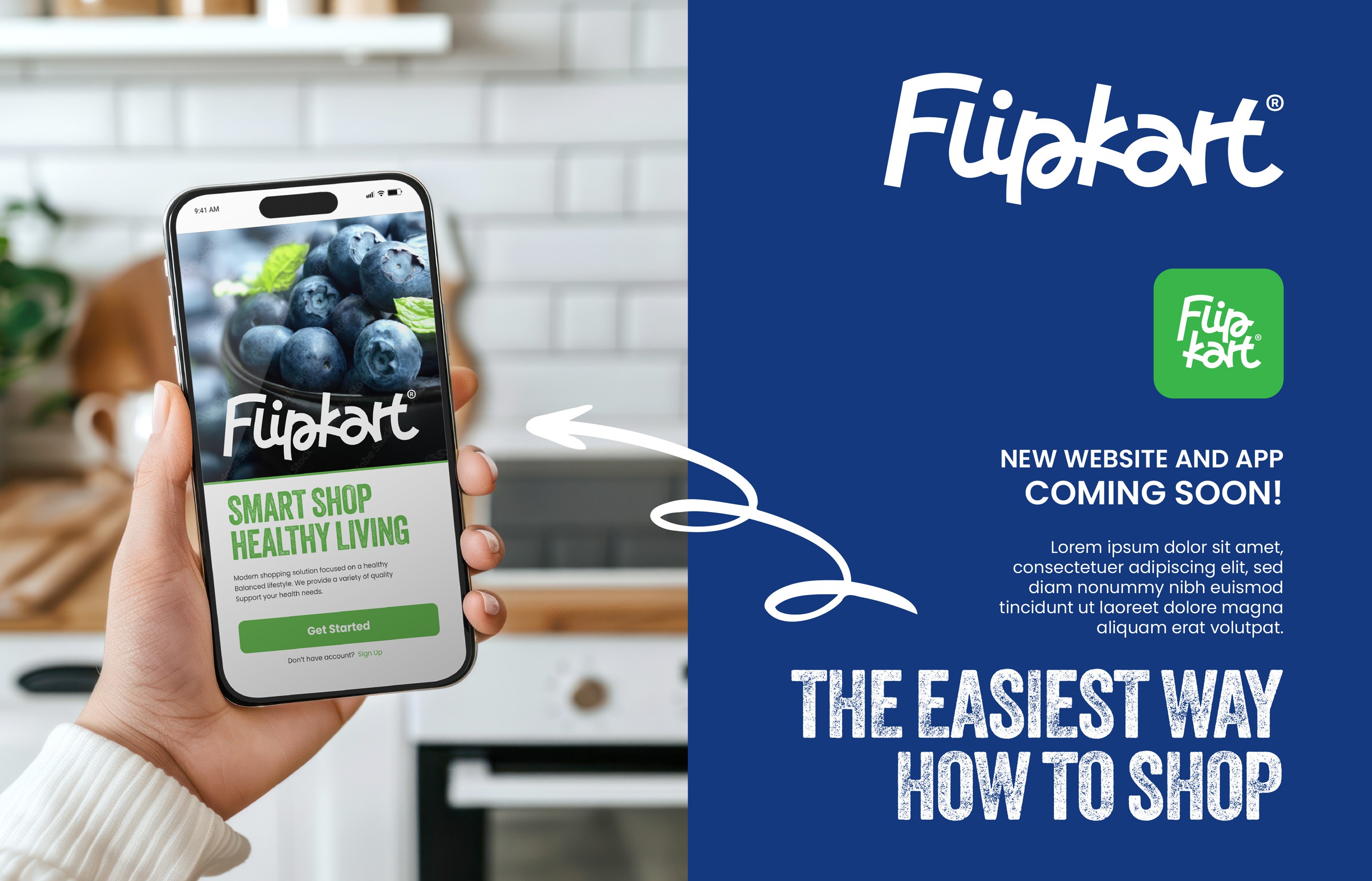

Working for the American startup Flipkart - an online marketplace covering groceries, electronics, fashion, and more - was both a big challenge and a lot of fun. At the core of the system is a custom hand-drawn logotype, designed to work seamlessly alongside a color system that spans across categories. Each product section has its own distinct color, and the logo must form a cohesive unit with each one. The entire visual language is accompanied by hand-drawn arrow motifs that tie everything together visually and point to the individual products that need to be highlighted in campaigns.
Poppins handles body copy while the textured Veneer typeface drives campaign headlines. Deliverables span brand guidelines, packaging, vehicle wraps, outdoor advertising, and digital UI mockups for web and mobile.
Working for the American startup Flipkart - an online marketplace covering groceries, electronics, fashion, and more - was both a big challenge and a lot of fun. At the core of the system is a custom hand-drawn logotype, designed to work seamlessly alongside a color system that spans across categories. Each product section has its own distinct color, and the logo must form a cohesive unit with each one. The entire visual language is accompanied by hand-drawn arrow motifs that tie everything together visually and point to the individual products that need to be highlighted in campaigns.
Poppins handles body copy while the textured Veneer typeface drives campaign headlines. Deliverables span brand guidelines, packaging, vehicle wraps, outdoor advertising, and digital UI mockups for web and mobile.