VAK
Logo and complete brand guidelines

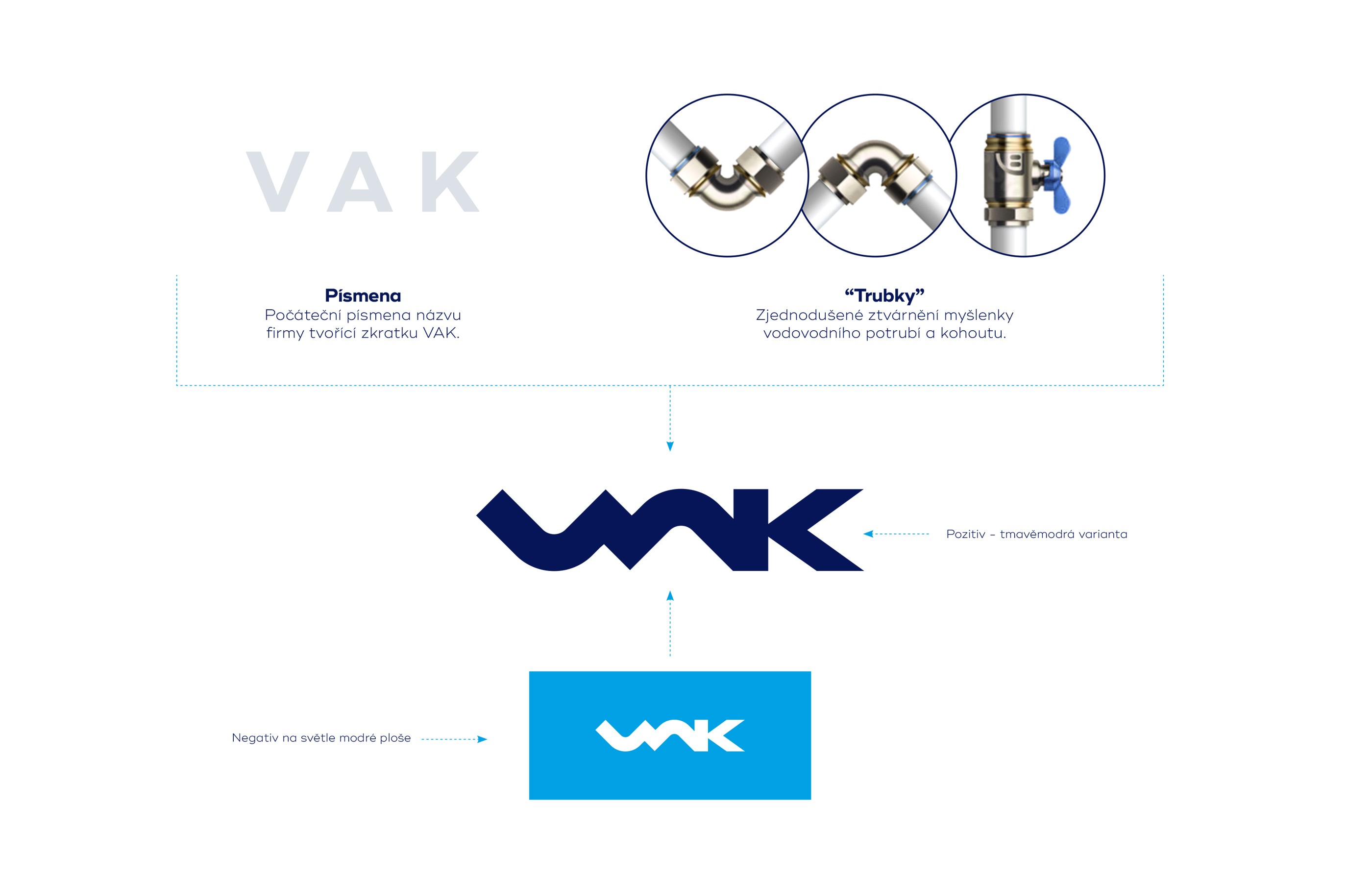
When I was approached to work on the rebranding of VAK Pardubice, I wasn't entirely sure at first how to approach the project — the existing logotype, over 50 years old, was quite limiting. In the end, I decided to go bold and make the identity ultra-modern, taking the company to a different level than it had been in previous years. The logo is formed by stylized initials resembling pipework capped with a valve. A modern minimalist style was deliberately chosen to set the company apart from others in the industry.
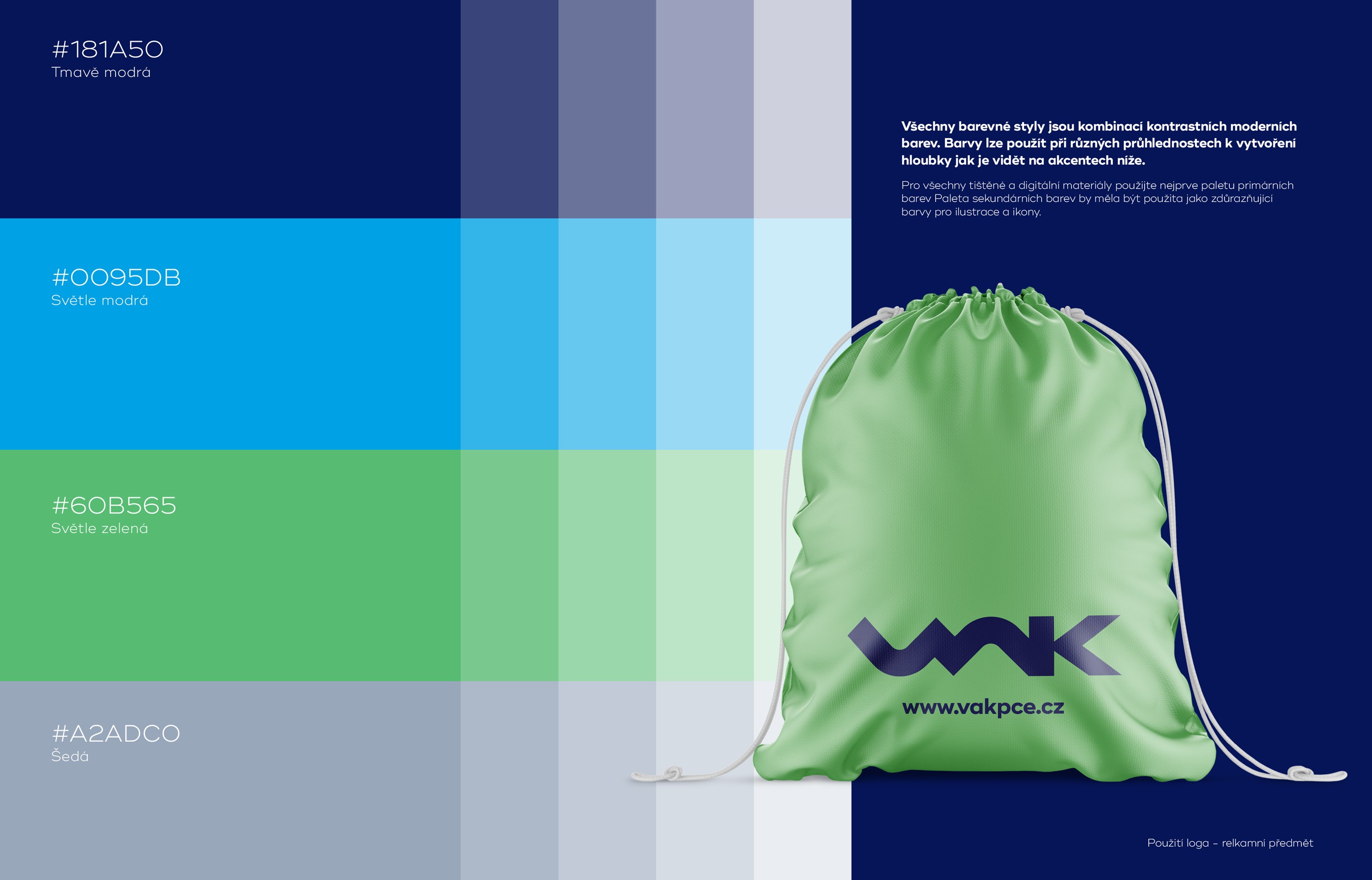
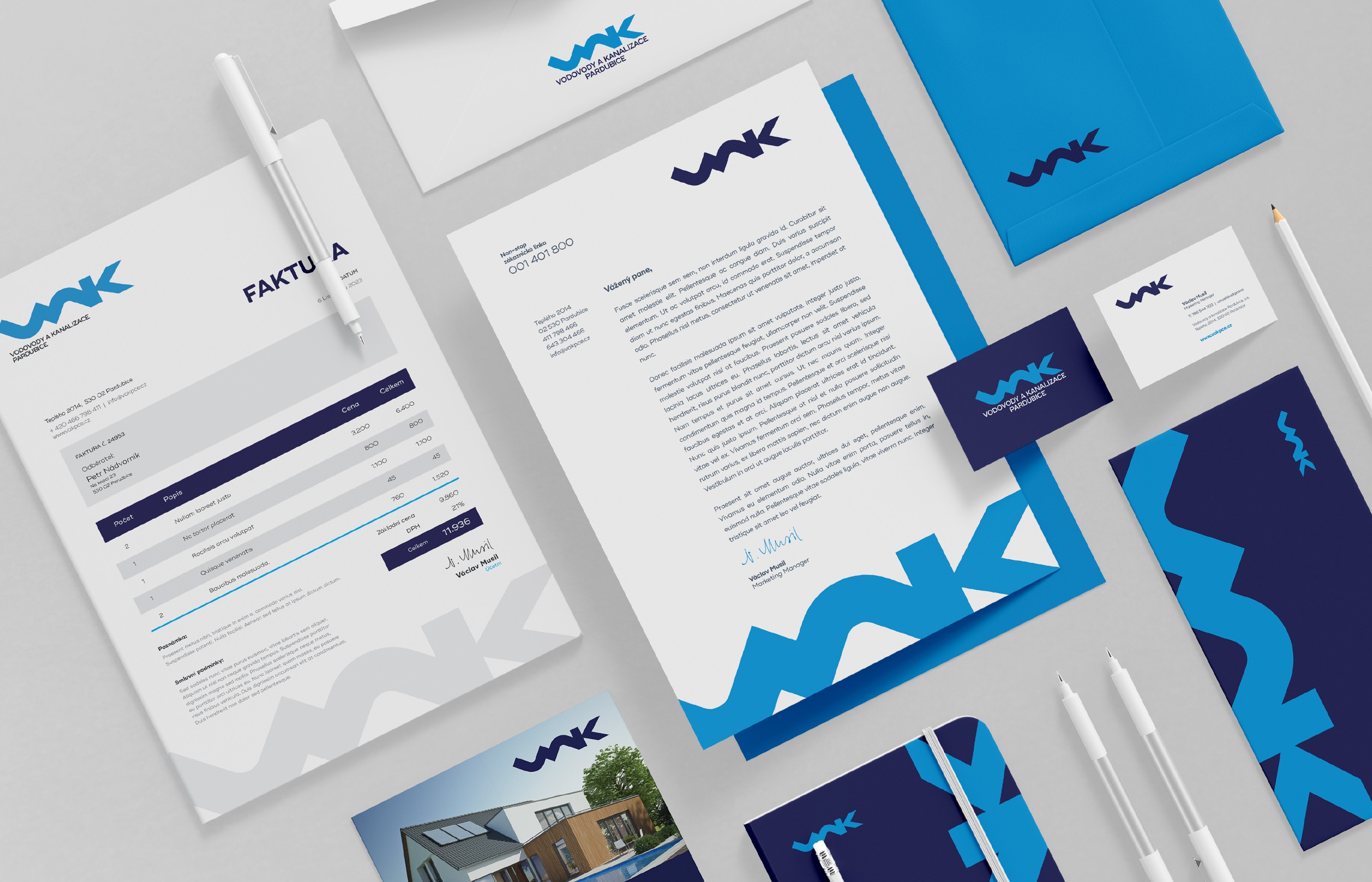
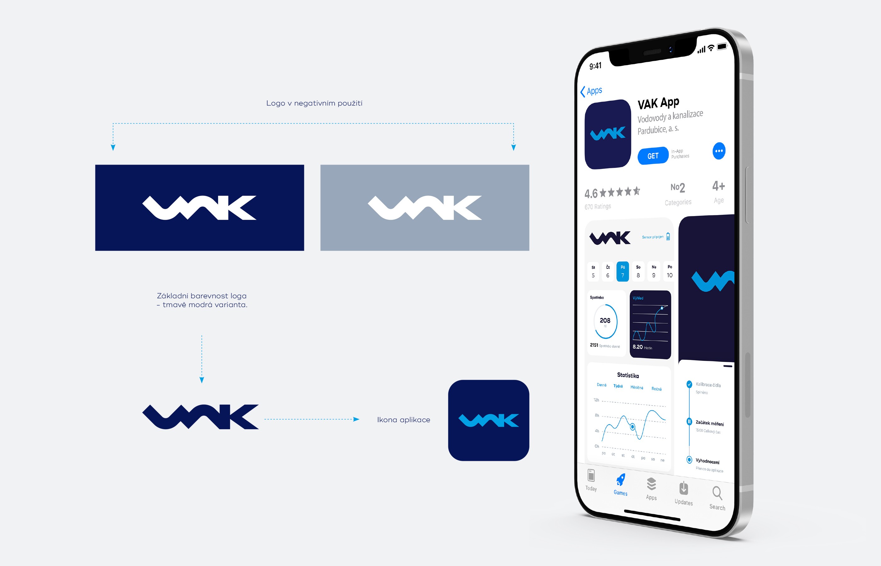
The palette pairs deep navy with electric blue and a fresh green accent, with colors applicable at varying opacities to create depth. Deliverables include brand guidelines, full stationery suite, outdoor advertising, tanker and workwear livery, promotional merchandise, and a mobile app with App Store listing.

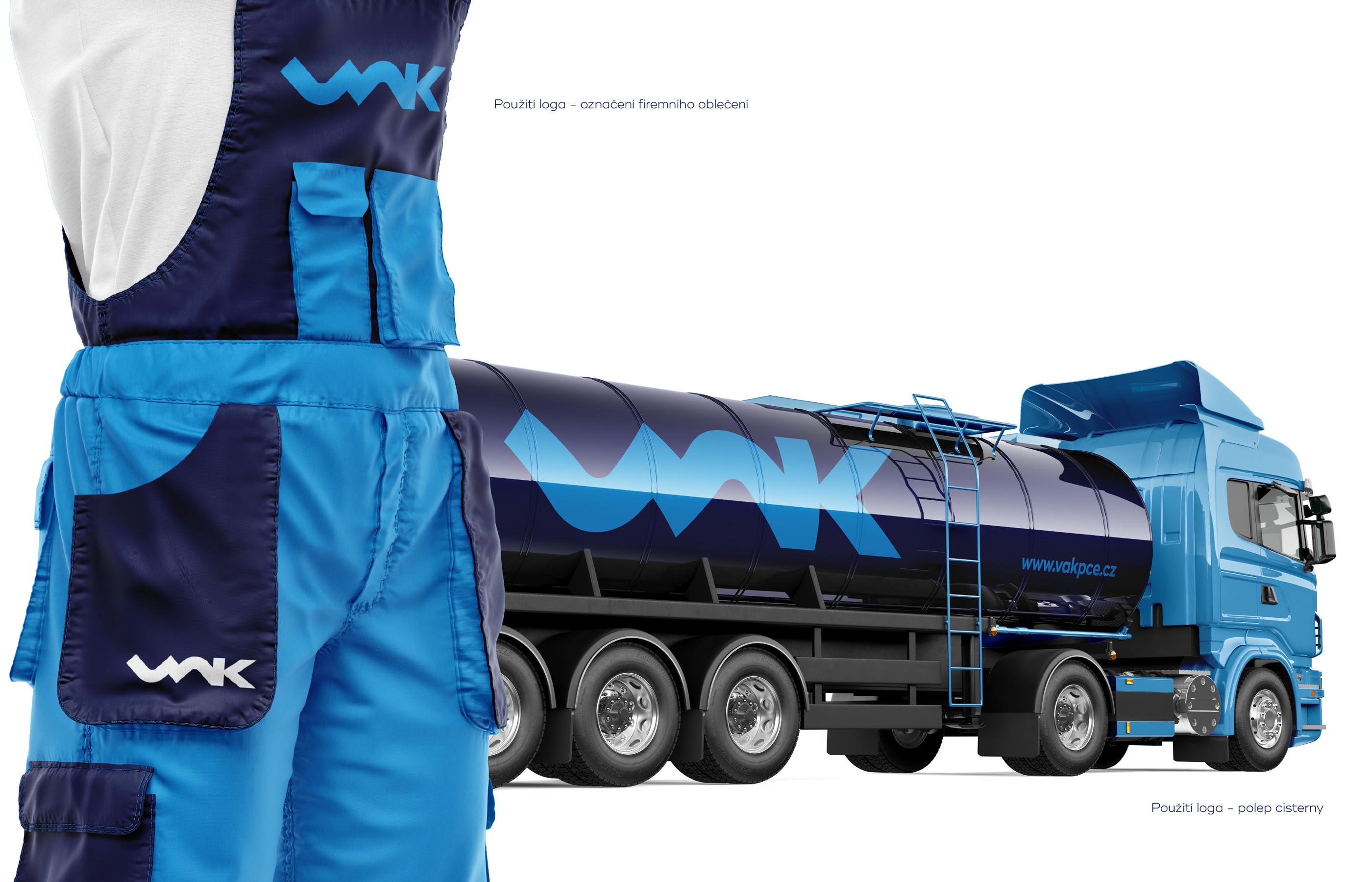
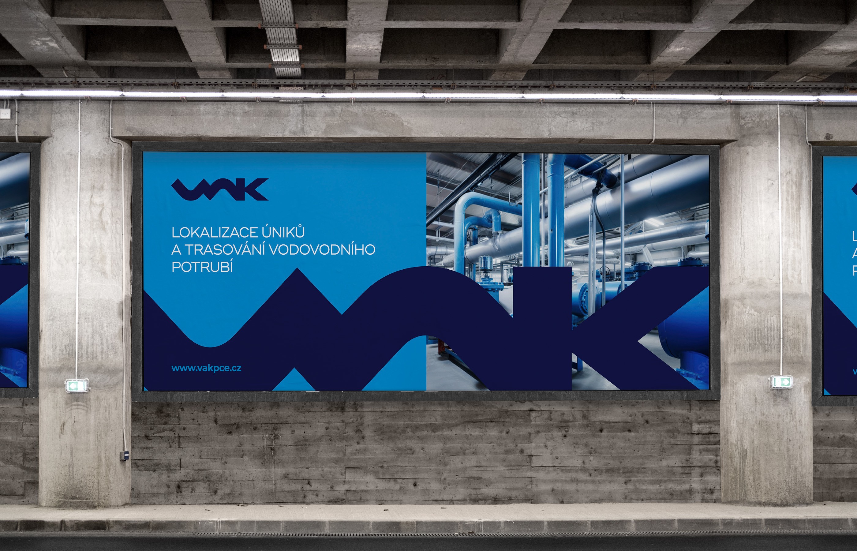
When I was approached to work on the rebranding of VAK Pardubice, I wasn't entirely sure at first how to approach the project — the existing logotype, over 50 years old, was quite limiting. In the end, I decided to go bold and make the identity ultra-modern, taking the company to a different level than it had been in previous years. The logo is formed by stylized initials resembling pipework capped with a valve. A modern minimalist style was deliberately chosen to set the company apart from others in the industry.
The palette pairs deep navy with electric blue and a fresh green accent, with colors applicable at varying opacities to create depth. Deliverables include brand guidelines, full stationery suite, outdoor advertising, tanker and workwear livery, promotional merchandise, and a mobile app with App Store listing.
When I was approached to work on the rebranding of VAK Pardubice, I wasn't entirely sure at first how to approach the project — the existing logotype, over 50 years old, was quite limiting. In the end, I decided to go bold and make the identity ultra-modern, taking the company to a different level than it had been in previous years. The logo is formed by stylized initials resembling pipework capped with a valve. A modern minimalist style was deliberately chosen to set the company apart from others in the industry.
The palette pairs deep navy with electric blue and a fresh green accent, with colors applicable at varying opacities to create depth. Deliverables include brand guidelines, full stationery suite, outdoor advertising, tanker and workwear livery, promotional merchandise, and a mobile app with App Store listing.