Patrion Legal
Complete identity from scratch
Although the company's name is derived from Latin and sounds English, it is a Czech law firm providing comprehensive legal services in commercial, civil, family, and criminal law—which, moreover, happens to be based in my hometown. Working on this project was a true pleasure from start to finish. The logo, the entire visual system, and the print deliverables across all touchpoints – from corporate stationery and outdoor advertising to vehicle wraps and website design – are rooted in a sophisticated style built upon a modern, elegant logo, bold coloring, and clean corporate typography.
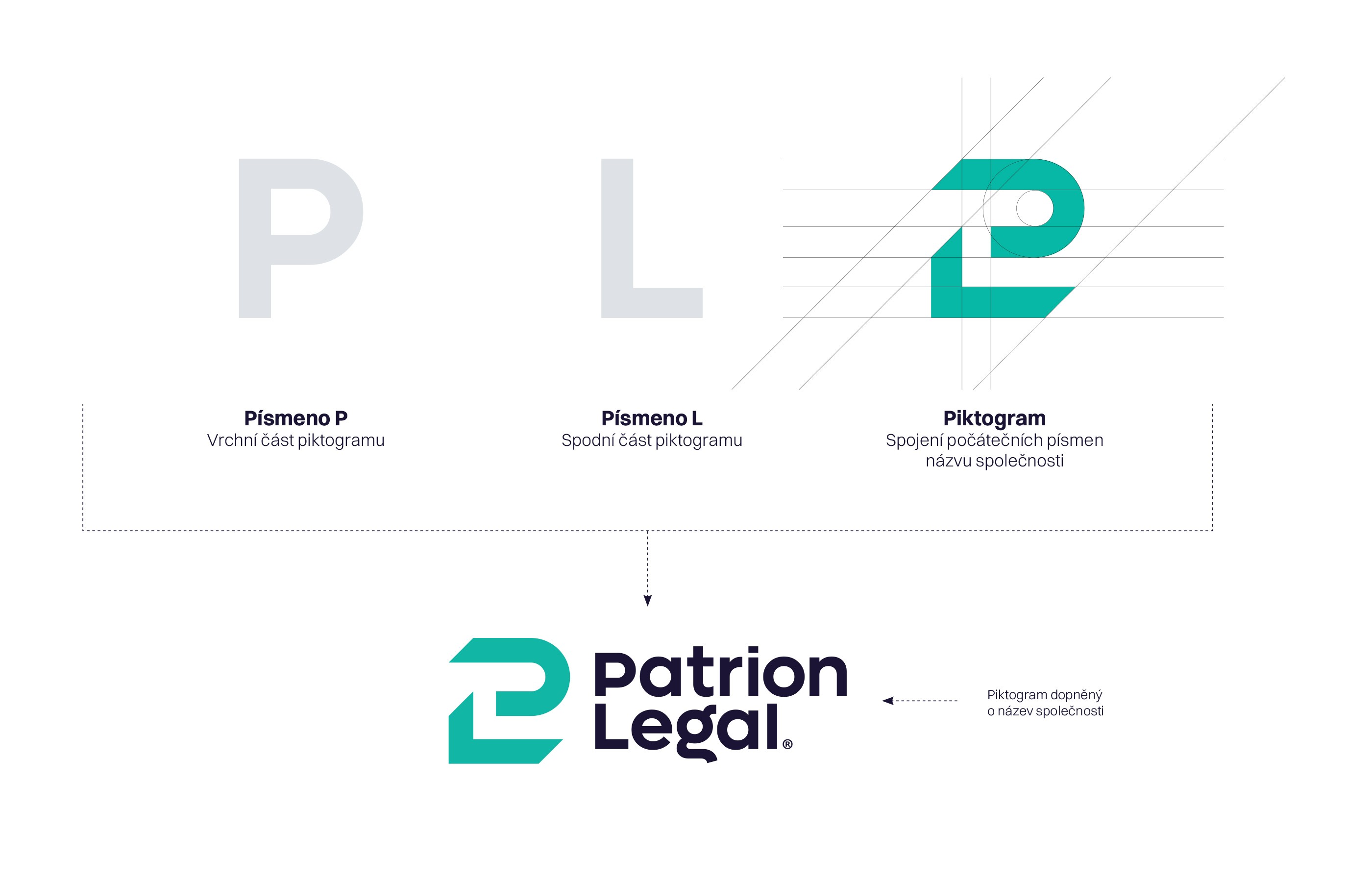
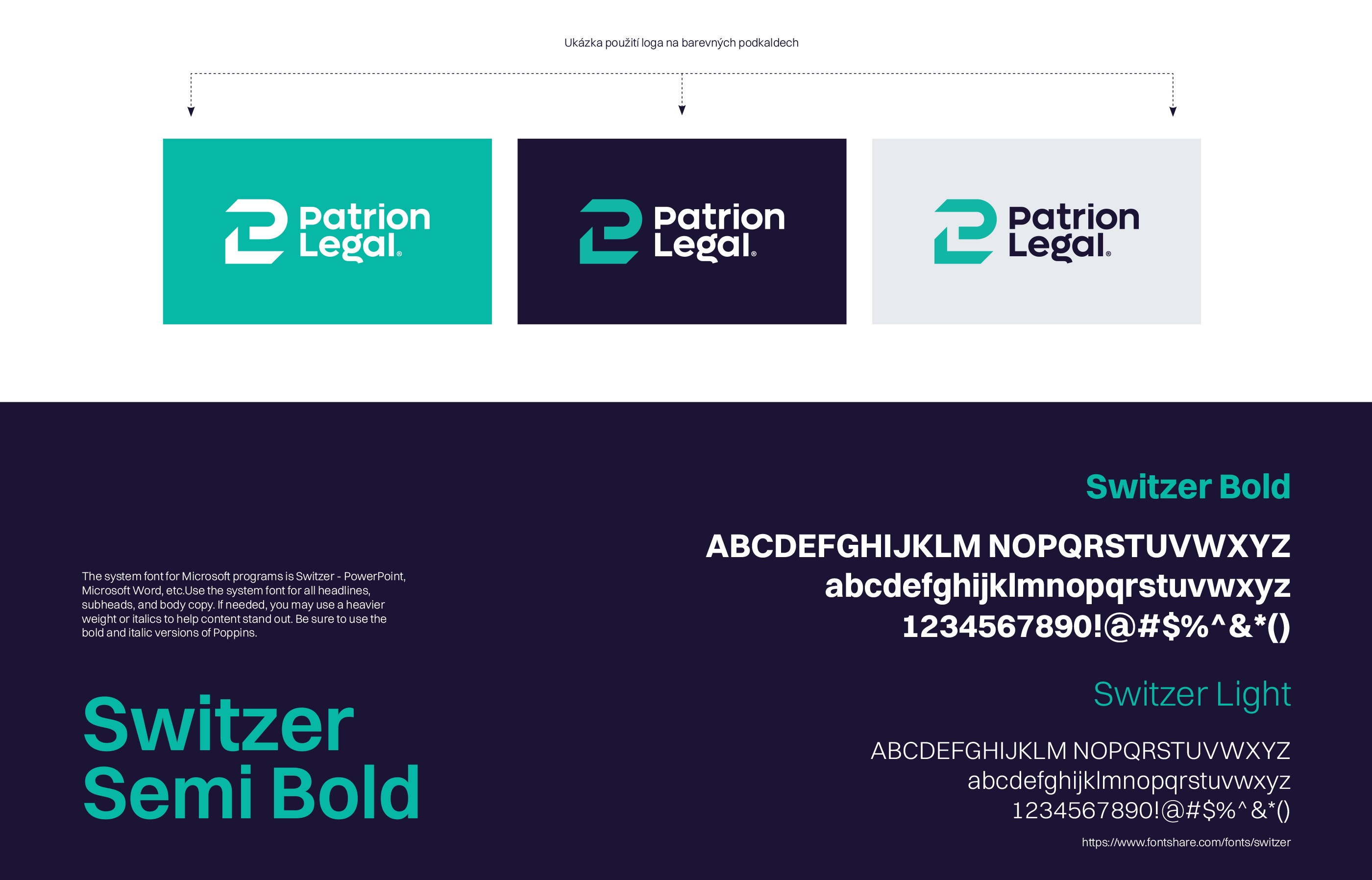

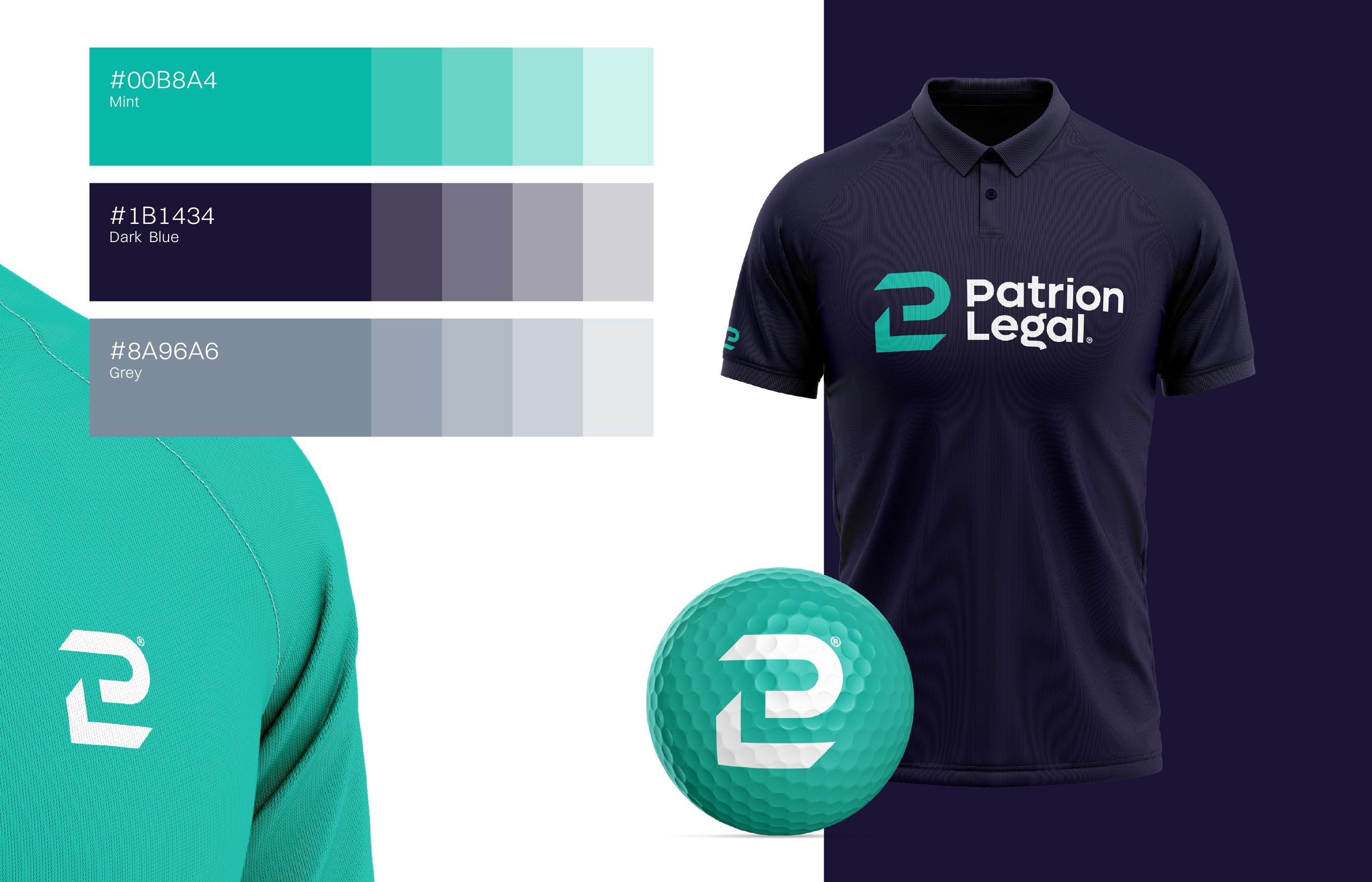
The logo itself is built on a fusion of the company's initials – the letter P forms the upper part of the pictogram, while the L shapes its lower half. This creates a compact symbol that simultaneously functions as a standalone icon. Through this dynamic, I aimed to communicate safety, protection, and certainty – qualities that are essential for a modern legal brand.

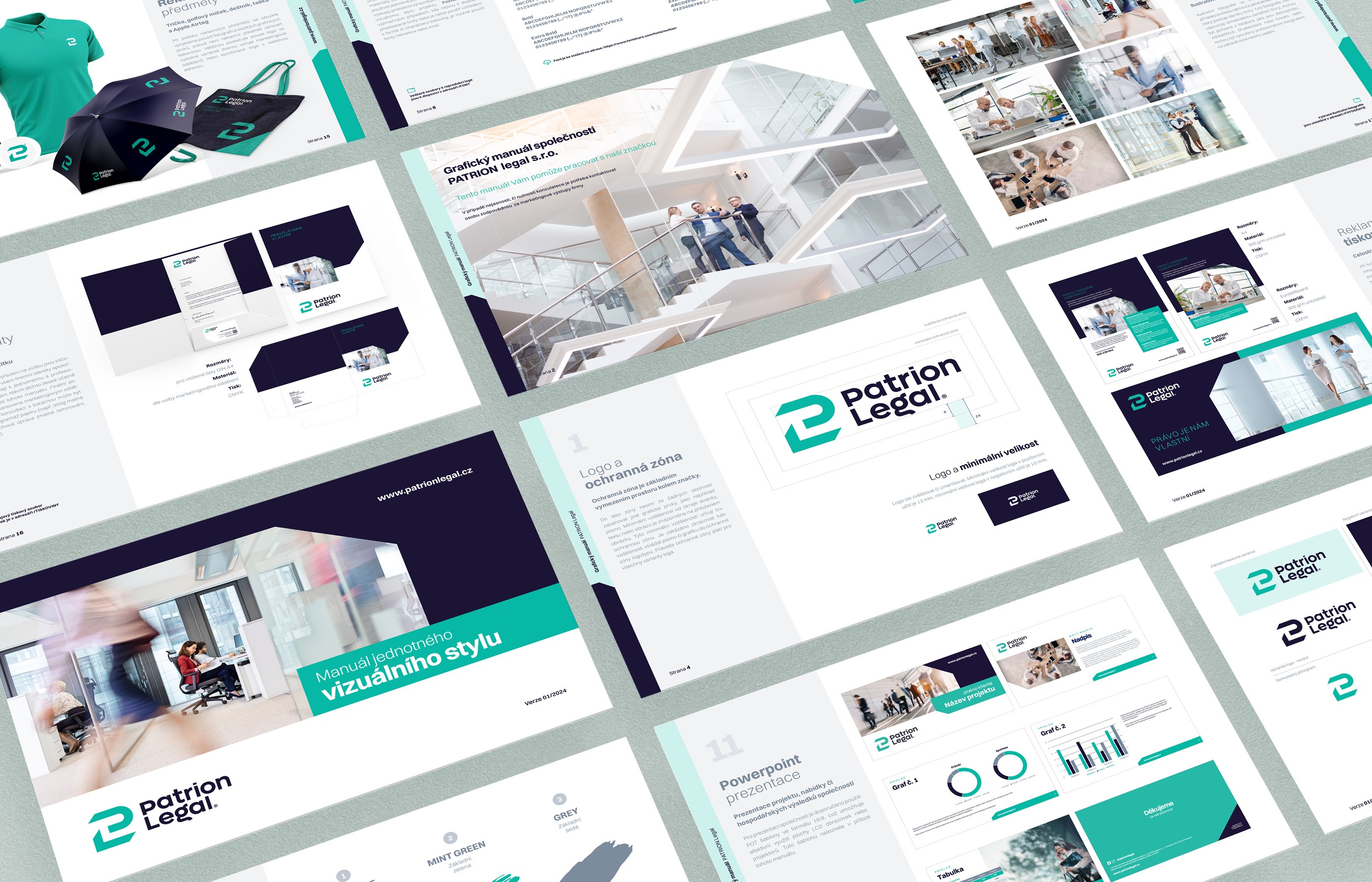

Although the company's name is derived from Latin and sounds English, it is a Czech law firm providing comprehensive legal services in commercial, civil, family, and criminal law—which, moreover, happens to be based in my hometown. Working on this project was a true pleasure from start to finish. The logo, the entire visual system, and the print deliverables across all touchpoints – from corporate stationery and outdoor advertising to vehicle wraps and website design – are rooted in a sophisticated style built upon a modern, elegant logo, bold coloring, and clean corporate typography.
The logo itself is built on a fusion of the company's initials – the letter P forms the upper part of the pictogram, while the L shapes its lower half. This creates a compact symbol that simultaneously functions as a standalone icon. Through this dynamic, I aimed to communicate safety, protection, and certainty – qualities that are essential for a modern legal brand.
Although the company's name is derived from Latin and sounds English, it is a Czech law firm providing comprehensive legal services in commercial, civil, family, and criminal law—which, moreover, happens to be based in my hometown. Working on this project was a true pleasure from start to finish. The logo, the entire visual system, and the print deliverables across all touchpoints – from corporate stationery and outdoor advertising to vehicle wraps and website design – are rooted in a sophisticated style built upon a modern, elegant logo, bold coloring, and clean corporate typography.
The logo itself is built on a fusion of the company's initials – the letter P forms the upper part of the pictogram, while the L shapes its lower half. This creates a compact symbol that simultaneously functions as a standalone icon. Through this dynamic, I aimed to communicate safety, protection, and certainty – qualities that are essential for a modern legal brand.