Opatovicky Poklad
Complete Visual System & Packaging Design
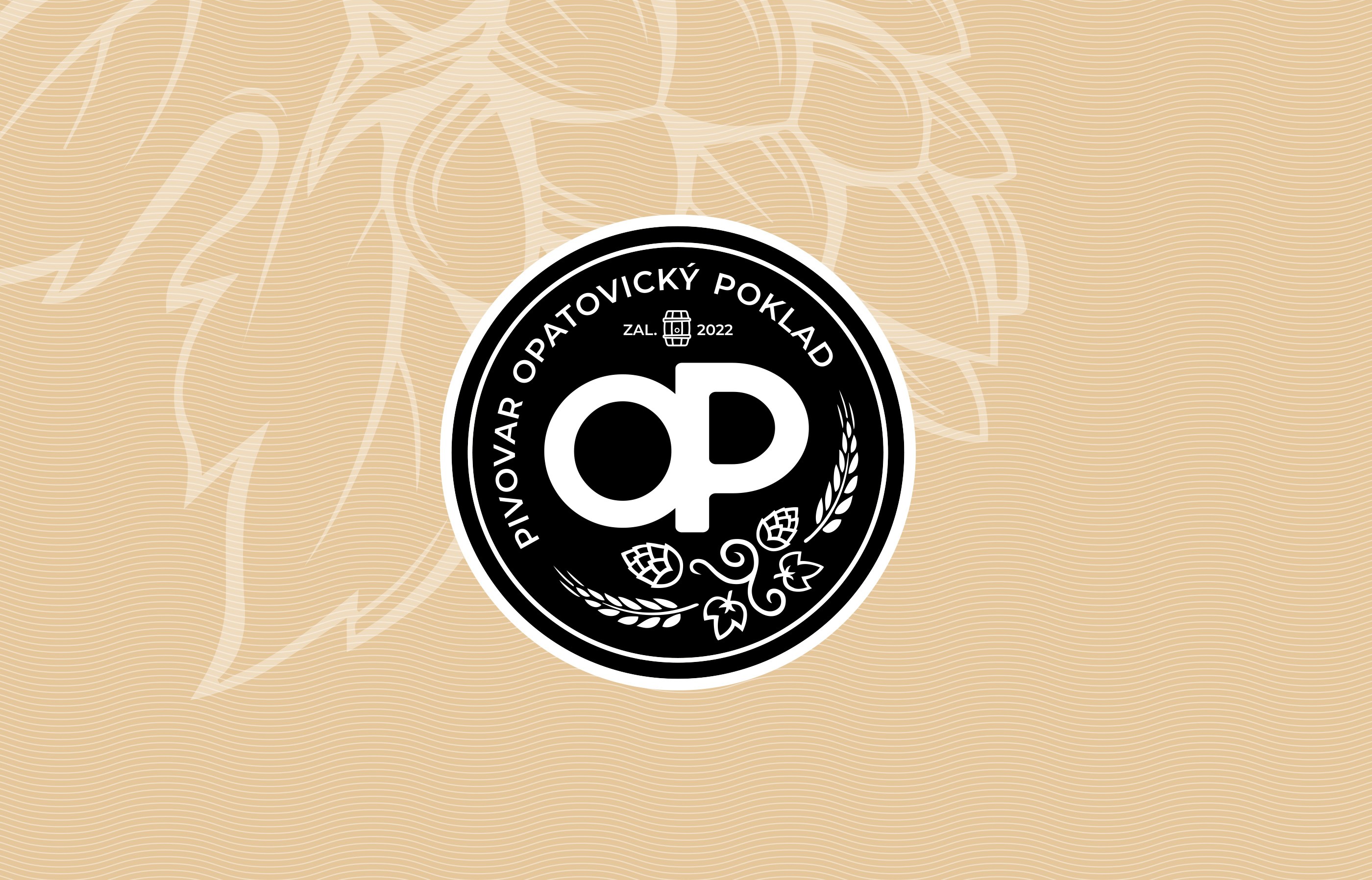
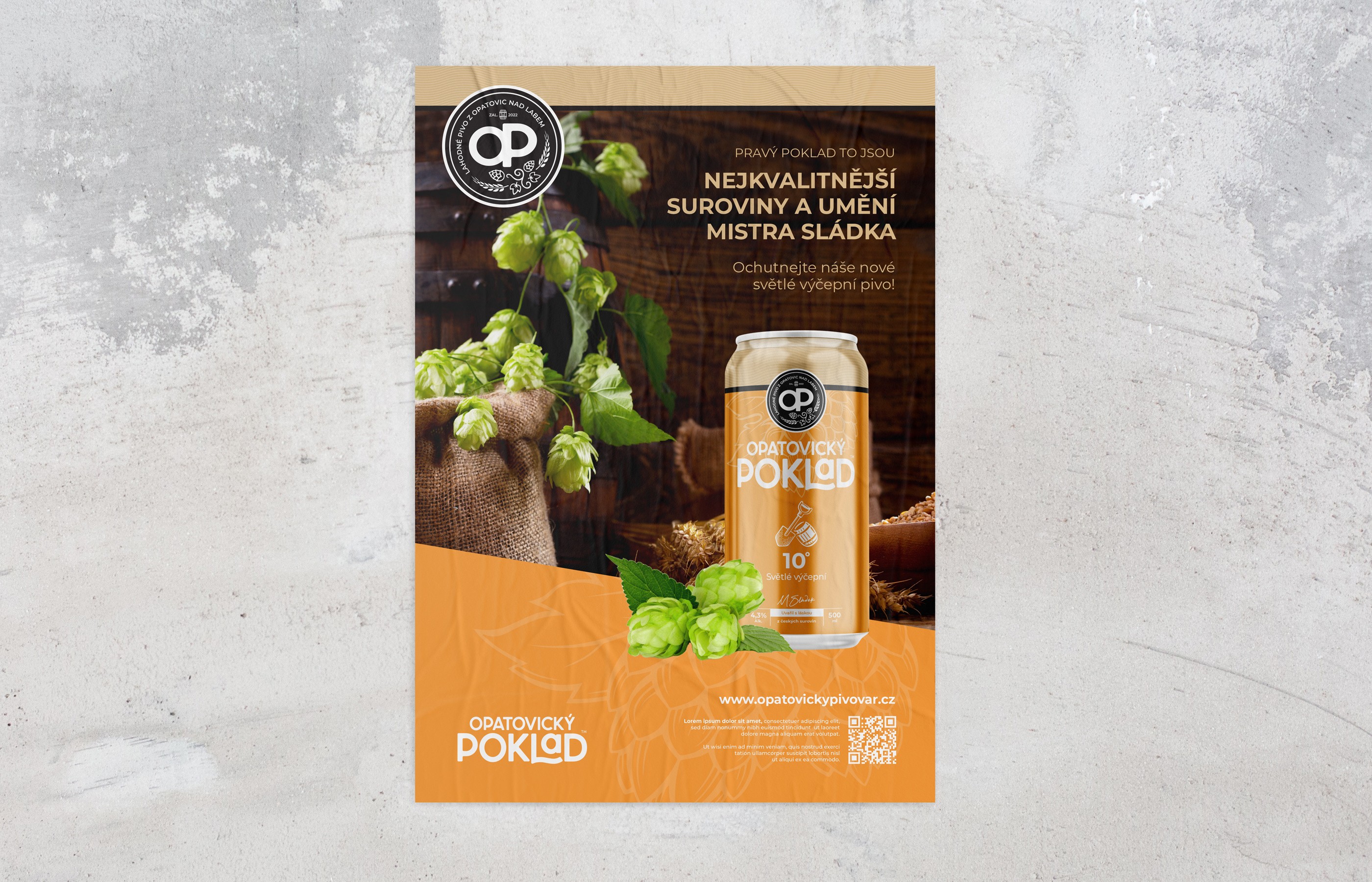
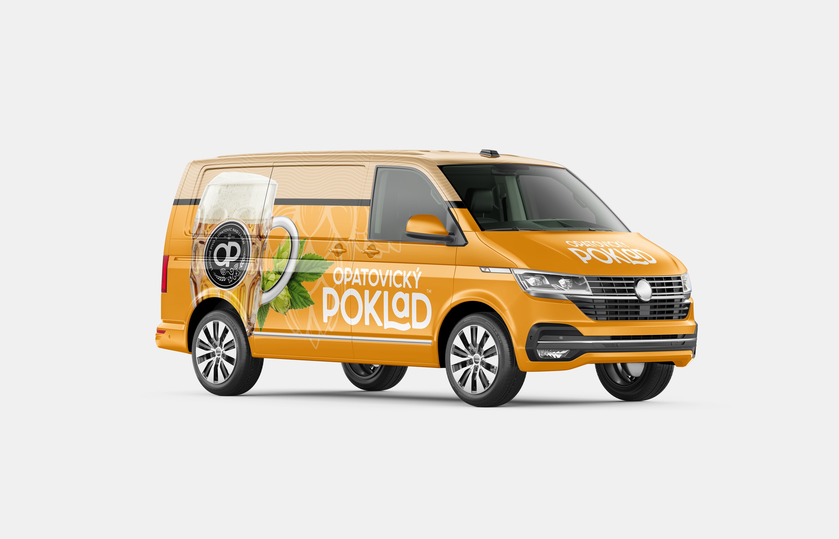
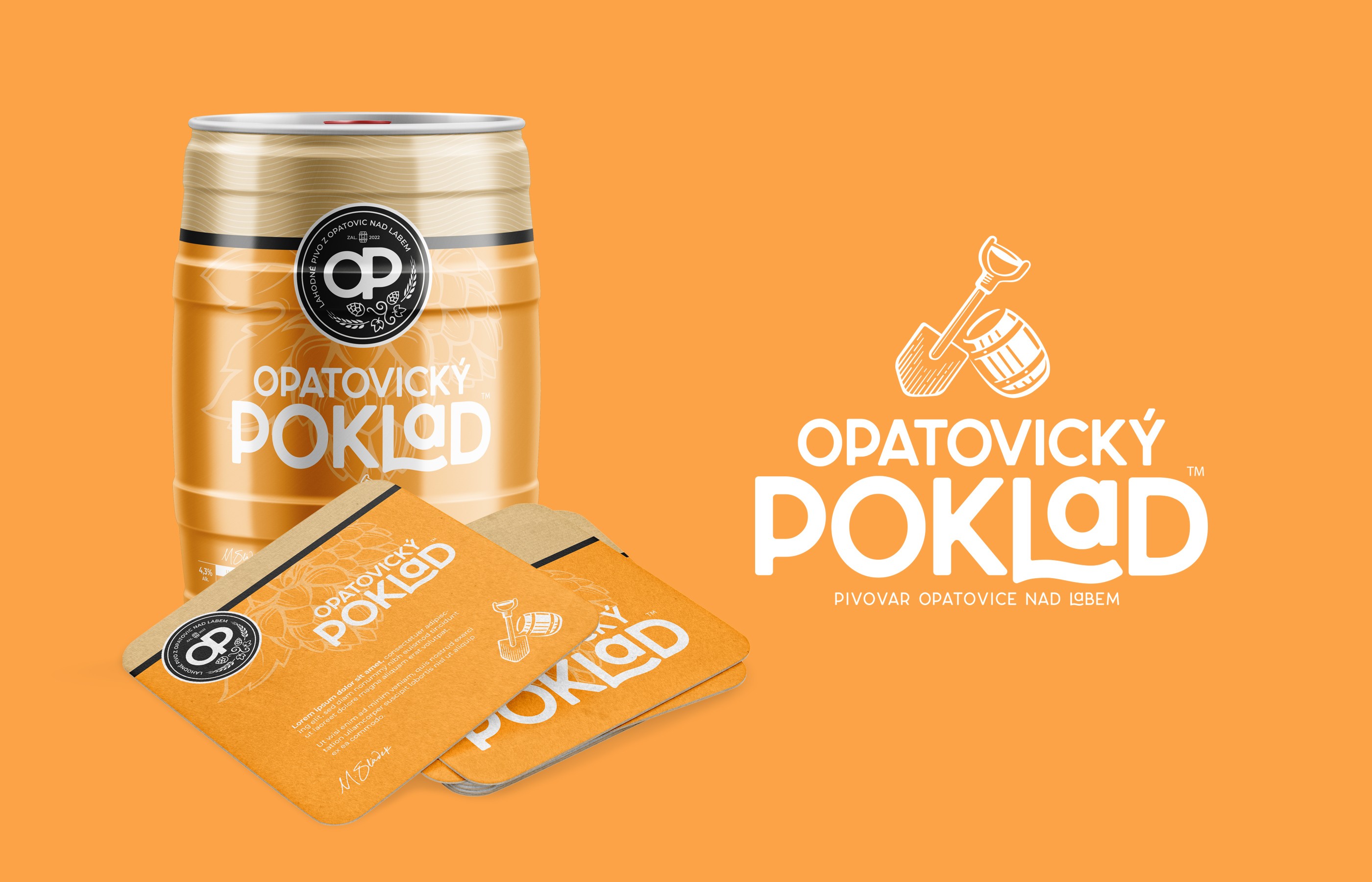
This project stands out slightly from the industries I am typically approached by. That made it all the more rewarding to create a comprehensive visual identity for a newly established brewery, this time including packaging design. It is another Czech-based project, providing a great balance to my work spanning across continents. The identity is built on two distinctive elements: the "Opatovický poklad" logotype, complemented by an illustration of a spade and a barrel, and a seal featuring a stylized OP monogram enriched with illustrations of hop cones.
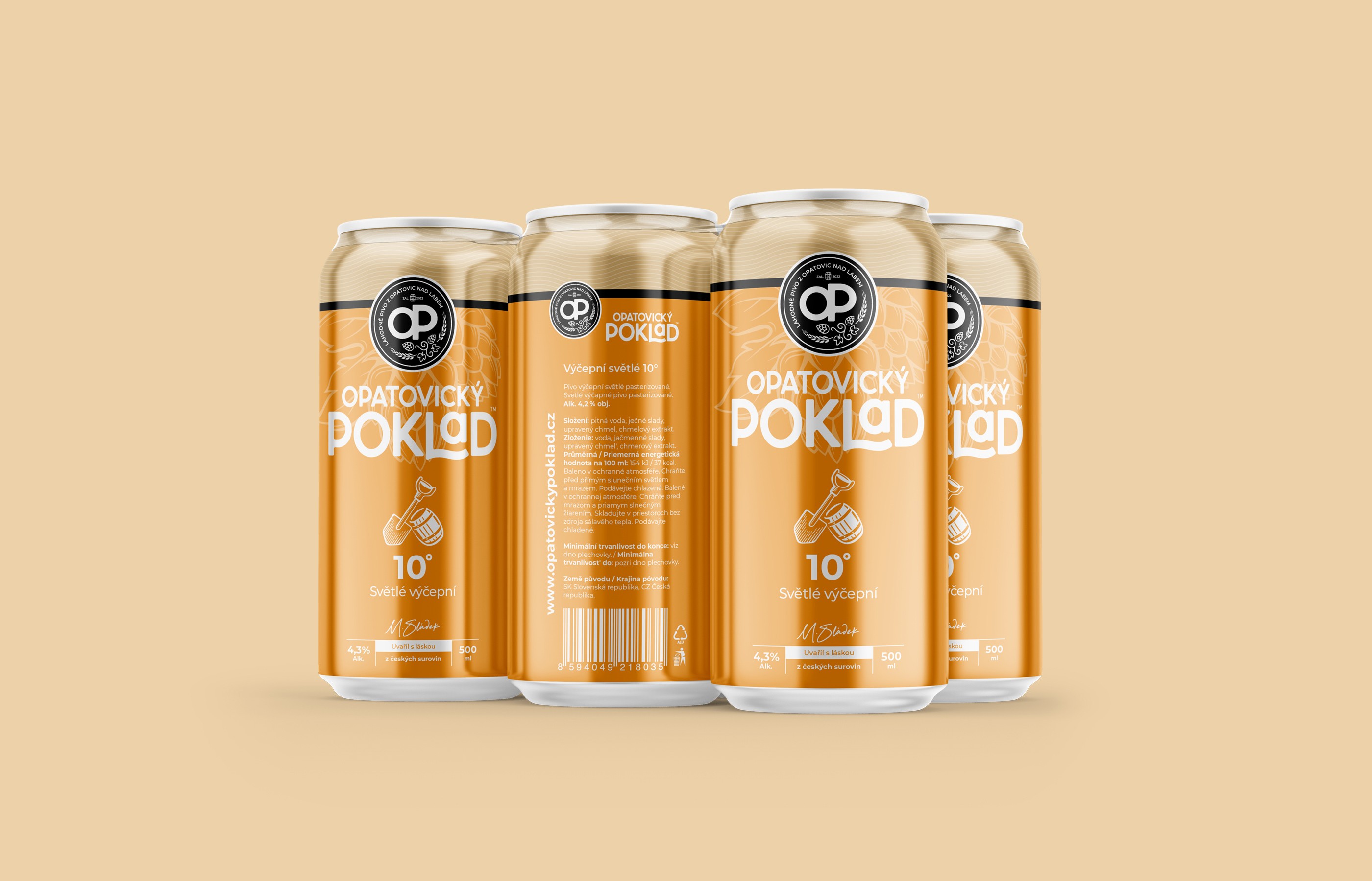
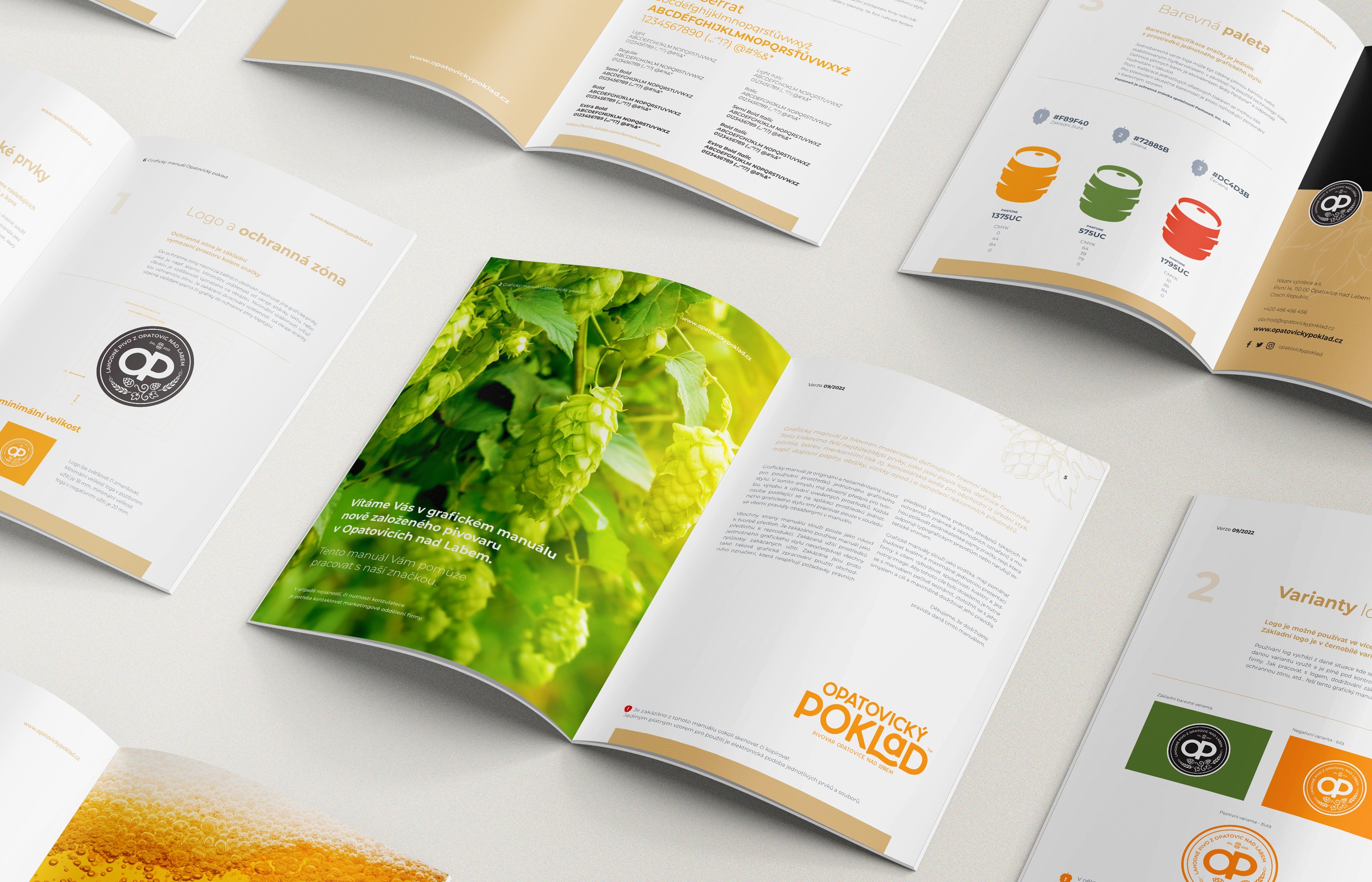
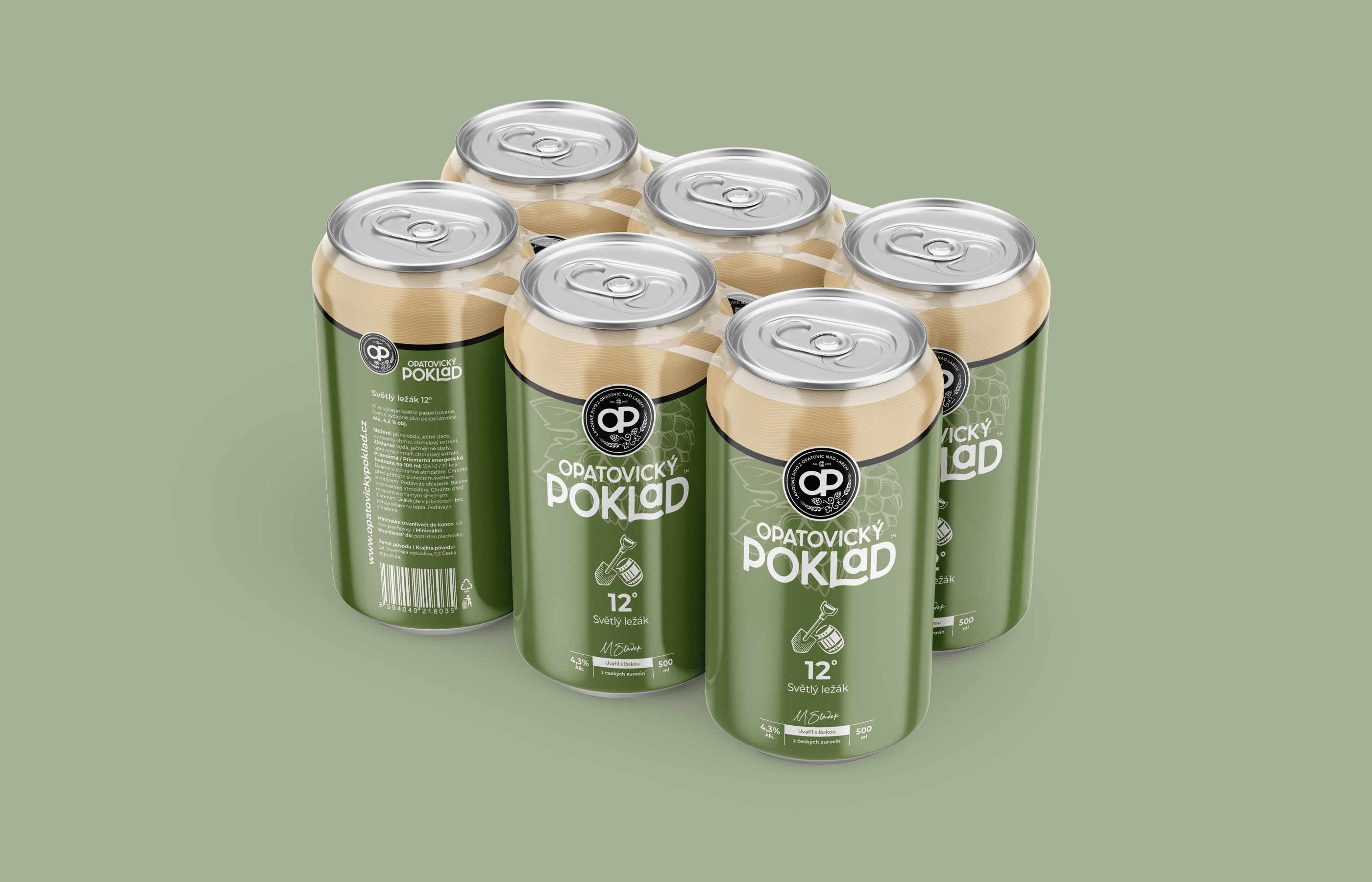
The chosen color scheme, presented in a warm amber palette, along with playful typography, reflects the character of a craft brewery with authentic local roots. Meanwhile, the distinct design for each beer variant ensures clarity within the product line and maintains its visual cohesion. Needless to say, the deliverables also included a complete brand guidelines manual.
This project stands out slightly from the industries I am typically approached by. That made it all the more rewarding to create a comprehensive visual identity for a newly established brewery, this time including packaging design. It is another Czech-based project, providing a great balance to my work spanning across continents. The identity is built on two distinctive elements: the "Opatovický poklad" logotype, complemented by an illustration of a spade and a barrel, and a seal featuring a stylized OP monogram enriched with illustrations of hop cones.
The chosen color scheme, presented in a warm amber palette, along with playful typography, reflects the character of a craft brewery with authentic local roots. Meanwhile, the distinct design for each beer variant ensures clarity within the product line and maintains its visual cohesion. Needless to say, the deliverables also included a complete brand guidelines manual.
This project stands out slightly from the industries I am typically approached by. That made it all the more rewarding to create a comprehensive visual identity for a newly established brewery, this time including packaging design. It is another Czech-based project, providing a great balance to my work spanning across continents. The identity is built on two distinctive elements: the "Opatovický poklad" logotype, complemented by an illustration of a spade and a barrel, and a seal featuring a stylized OP monogram enriched with illustrations of hop cones.
The chosen color scheme, presented in a warm amber palette, along with playful typography, reflects the character of a craft brewery with authentic local roots. Meanwhile, the distinct design for each beer variant ensures clarity within the product line and maintains its visual cohesion. Needless to say, the deliverables also included a complete brand guidelines manual.