HBM Space
Visual Identity

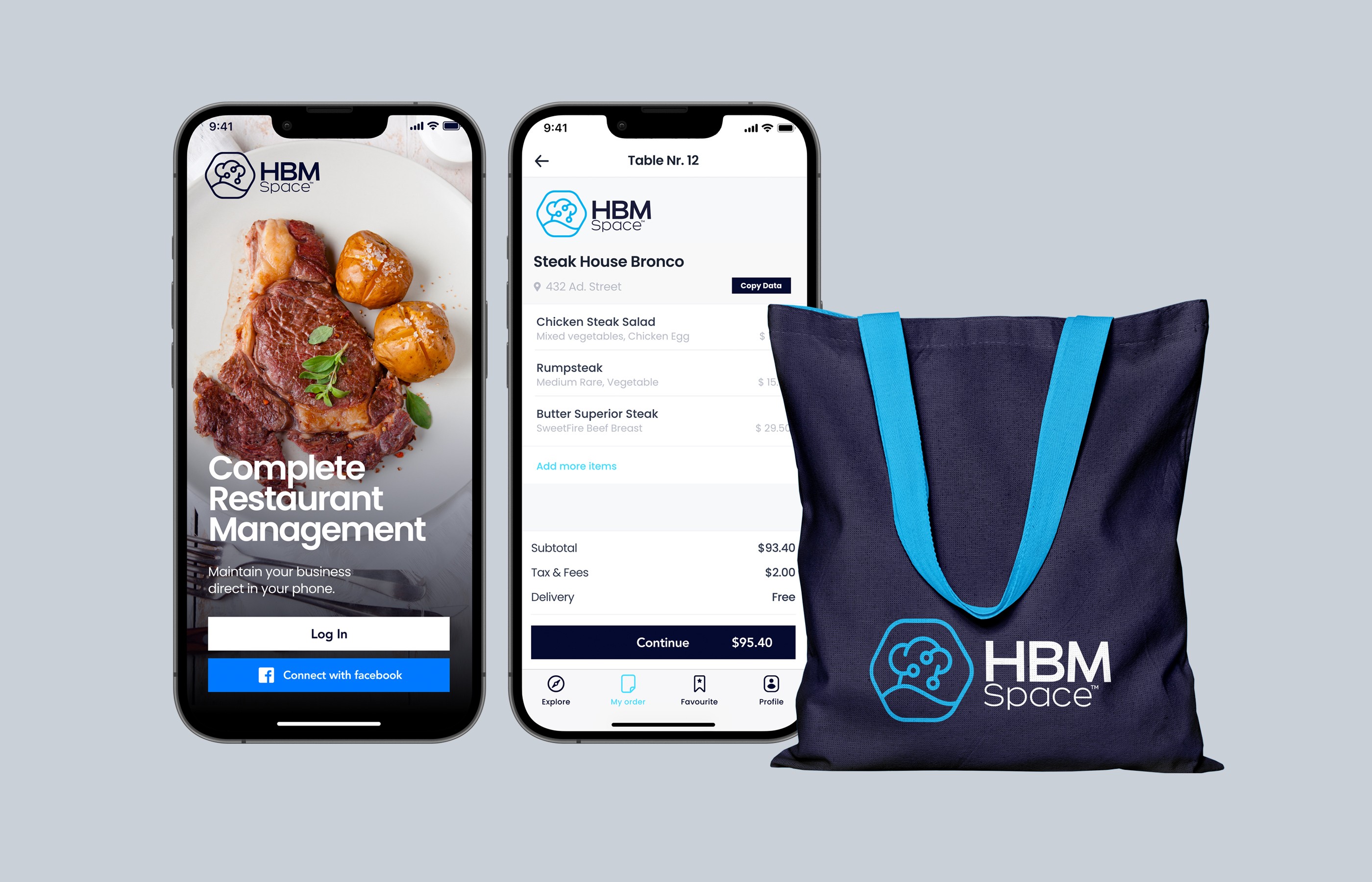
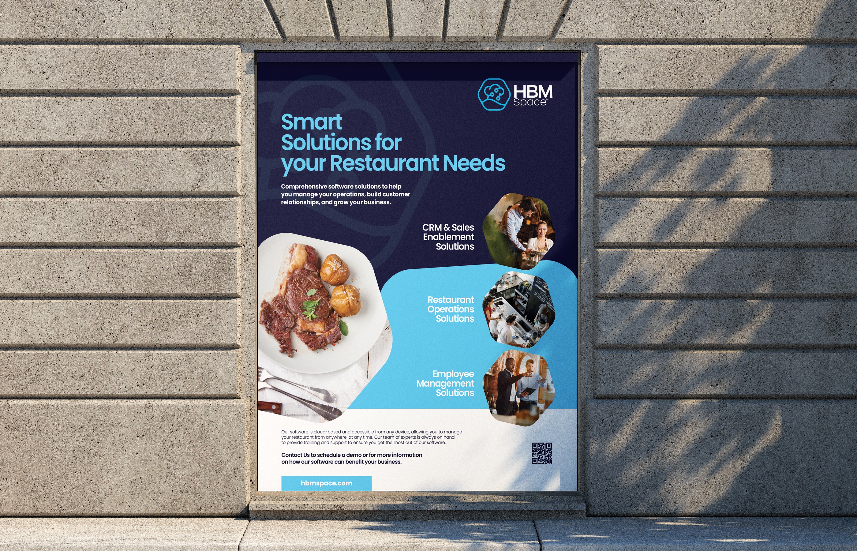
This project also comes from the startup sector, brought to me by a returning client. This time, the brief was to create a visual identity for a startup providing smart solutions for restaurants – a software company, in essence. I chose a color scheme that lends the brand a confident, tech-driven character. These colors are consistently applied across corporate stationery, outdoor advertising, app UI design, merchandising, and the comprehensive website concept.

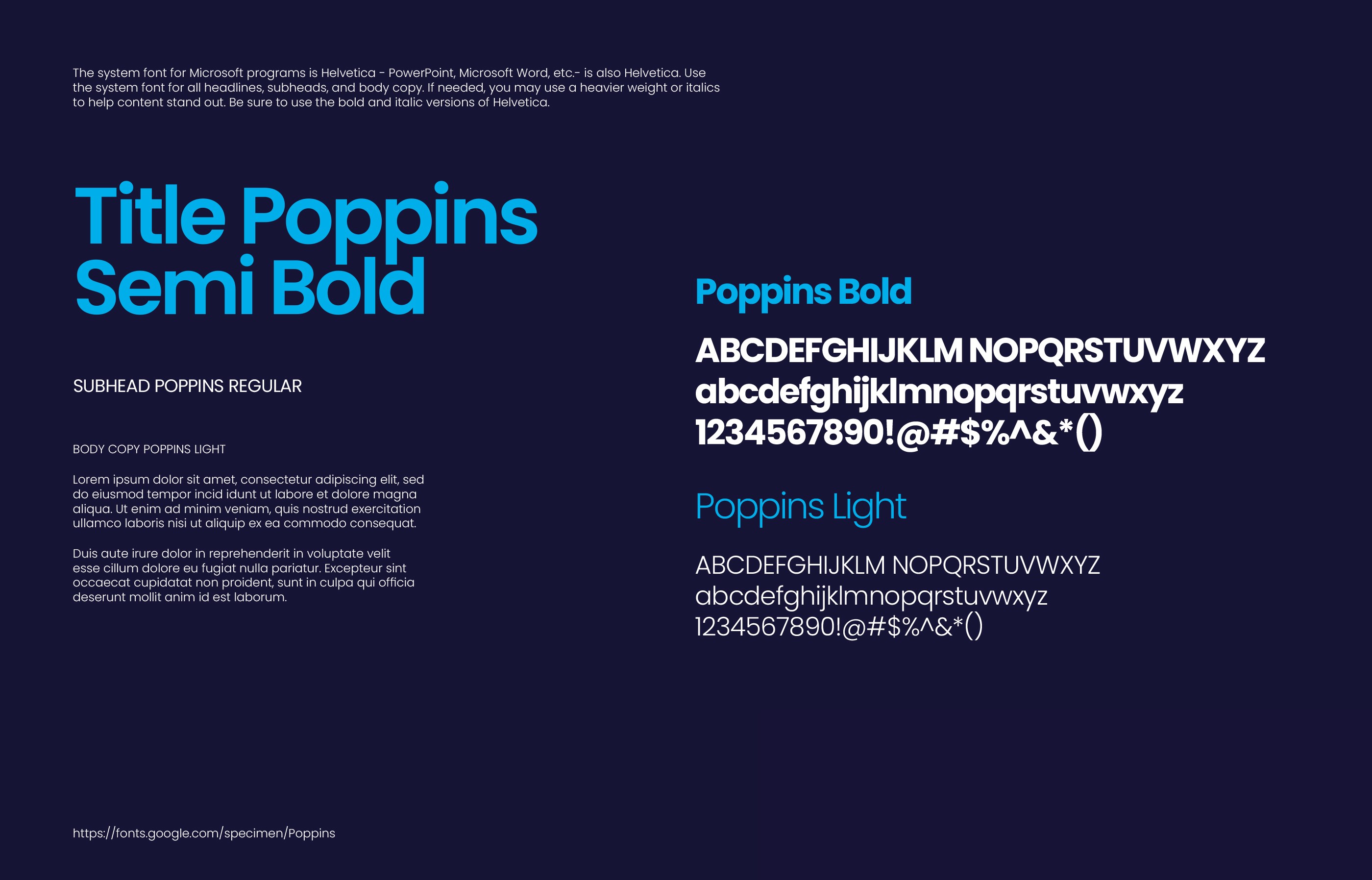

The logo, comprising a bold pictogram and a logotype, stands as a chapter on its own. In the pictogram, I merged the two worlds the brand operates in – a chef's hat representing gastronomy and a printed circuit board (PCB) symbolizing information technology. The result is a compact hexagonal symbol that instantly communicates the brand's dual nature. This logo works flawlessly on all delivered assets, whether in print or digital form, which was one of the core requirements of the brief. As with previous projects, a complete brand guidelines manual was delivered.

This project also comes from the startup sector, brought to me by a returning client. This time, the brief was to create a visual identity for a startup providing smart solutions for restaurants – a software company, in essence. I chose a color scheme that lends the brand a confident, tech-driven character. These colors are consistently applied across corporate stationery, outdoor advertising, app UI design, merchandising, and the comprehensive website concept.
The logo, comprising a bold pictogram and a logotype, stands as a chapter on its own. In the pictogram, I merged the two worlds the brand operates in – a chef's hat representing gastronomy and a printed circuit board (PCB) symbolizing information technology. The result is a compact hexagonal symbol that instantly communicates the brand's dual nature. This logo works flawlessly on all delivered assets, whether in print or digital form, which was one of the core requirements of the brief. As with previous projects, a complete brand guidelines manual was delivered.


