Furniture Manor
Logo creation and complete company materials
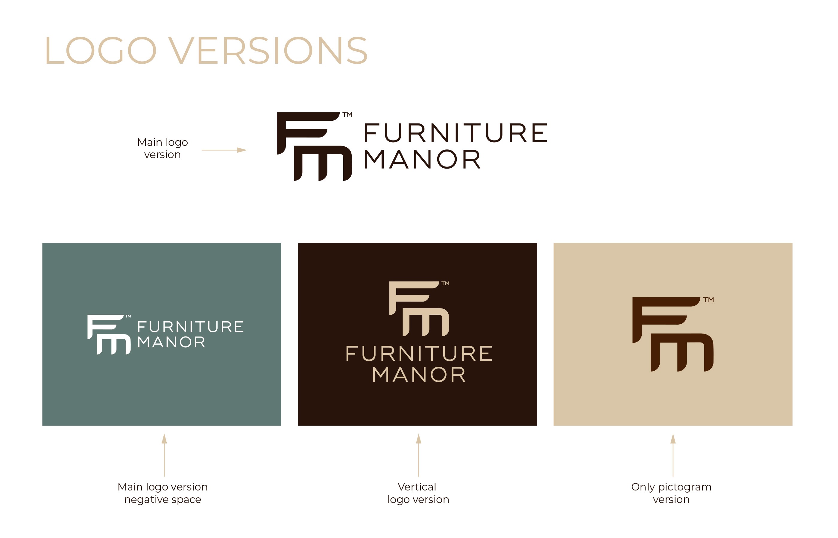
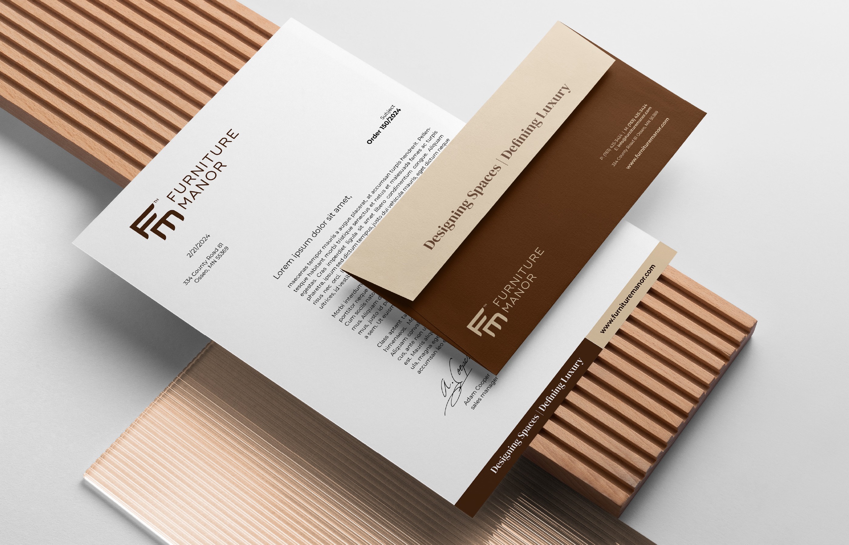
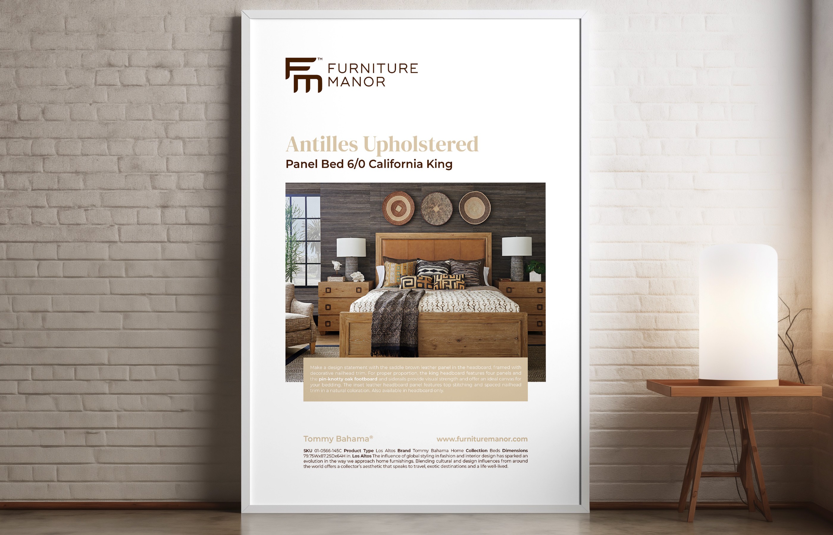
Another interesting recent project was the design of a comprehensive brand identity for a premium furniture retailer based in Minnesota. The identity is built around a custom FM pictogram that evokes elegance and warmth – its clean geometric construction with finely crafted details reflects the brand's positioning at the intersection of quality craftsmanship and affordable luxury.
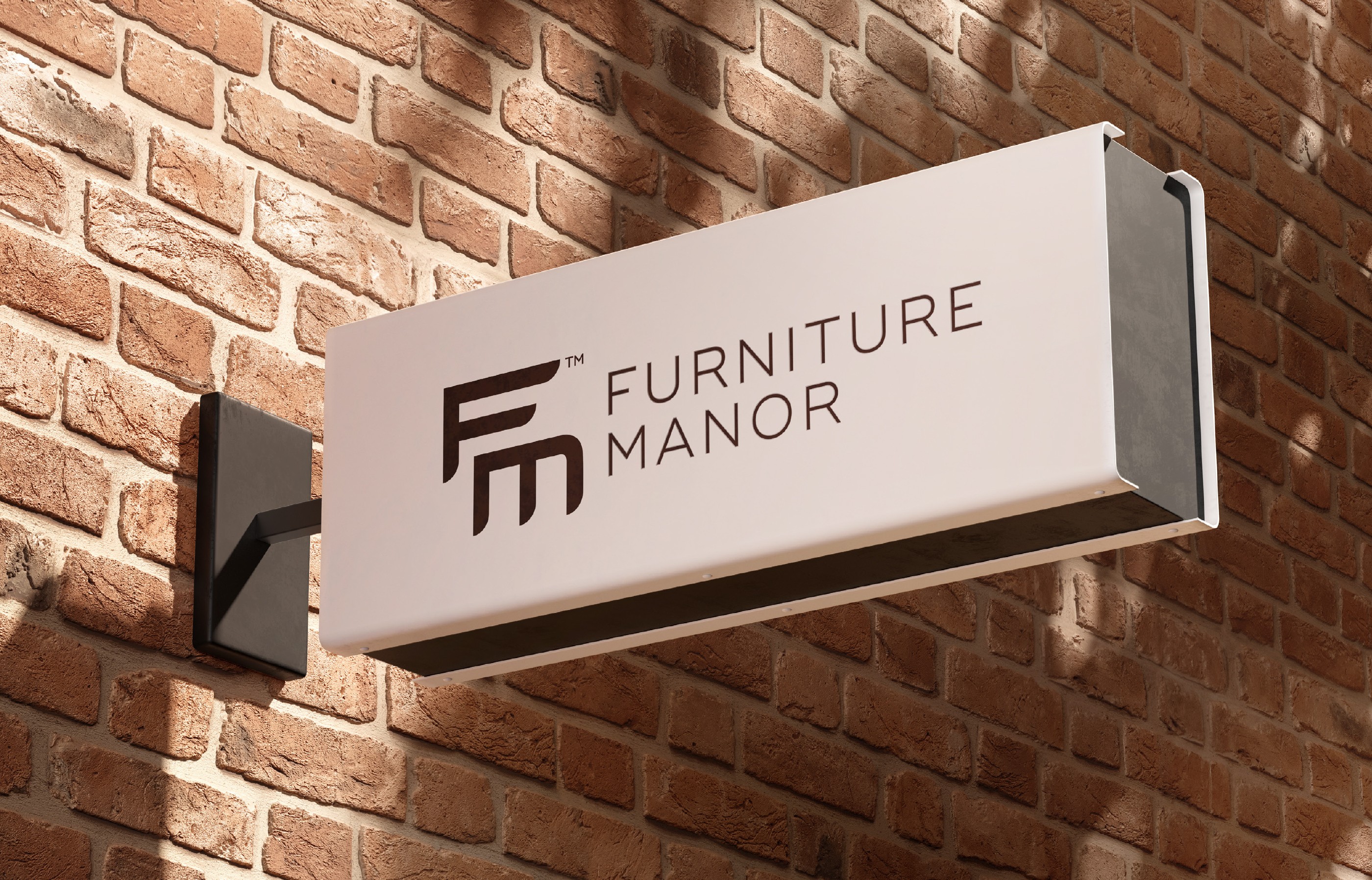
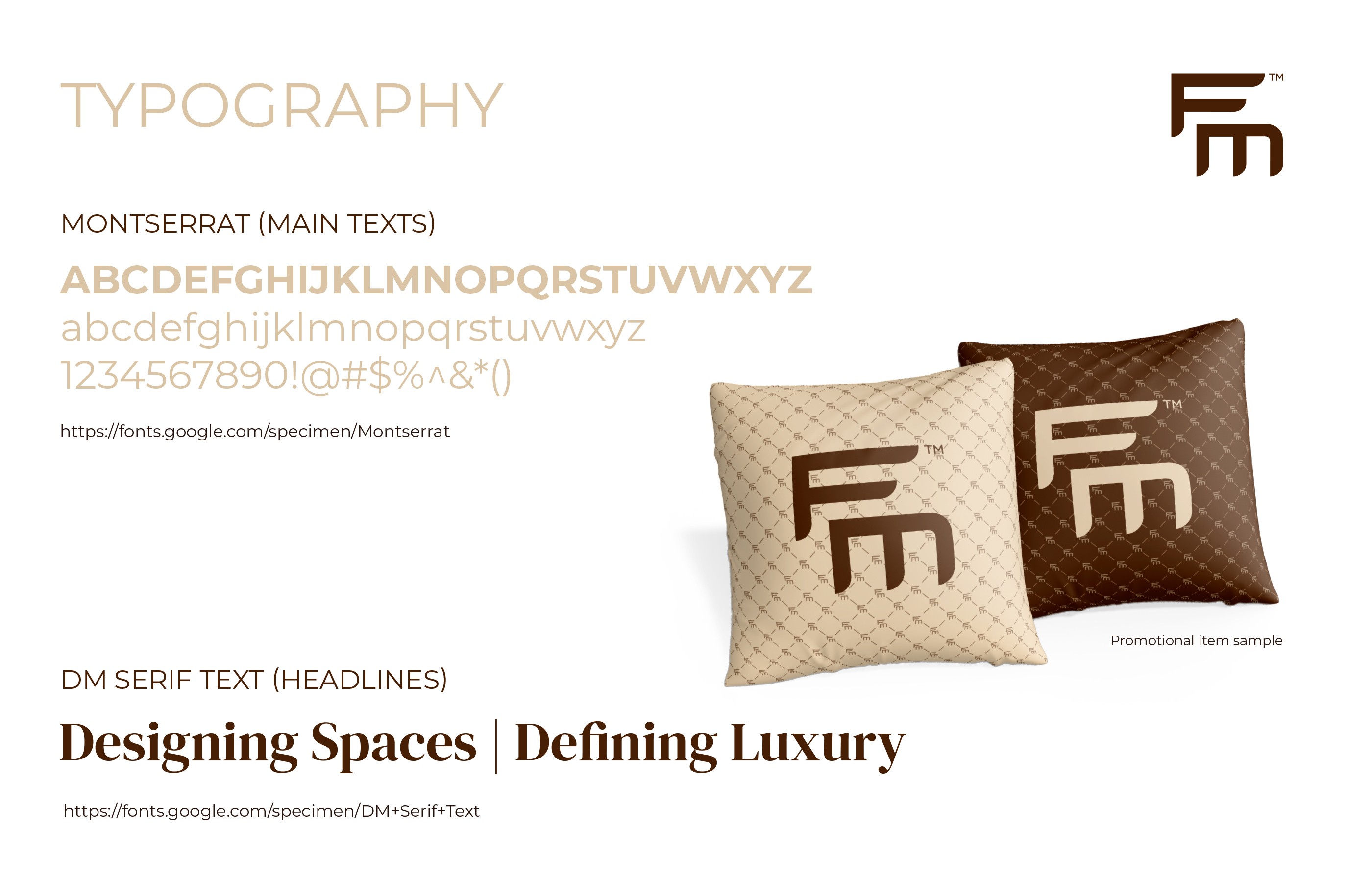
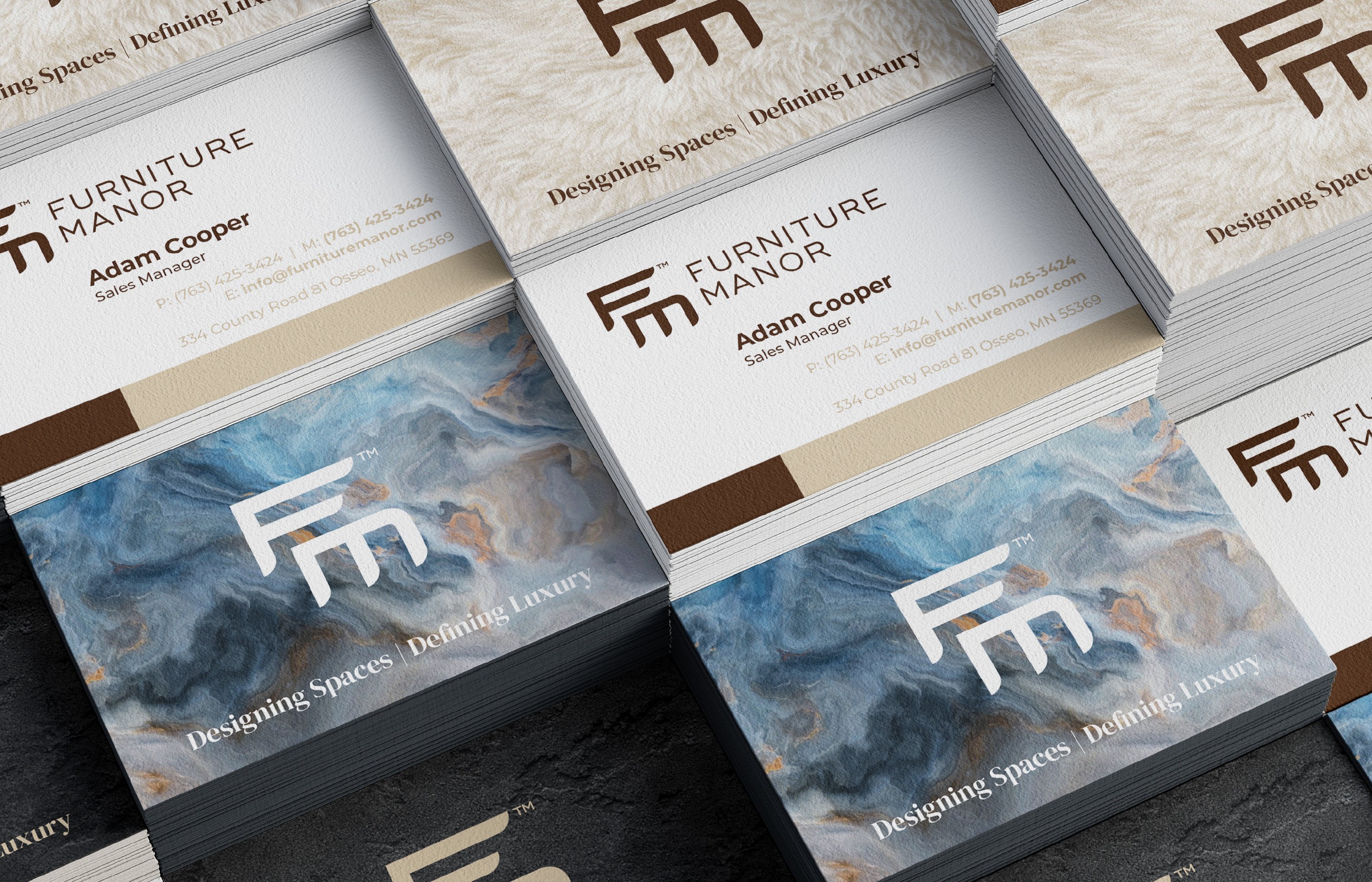
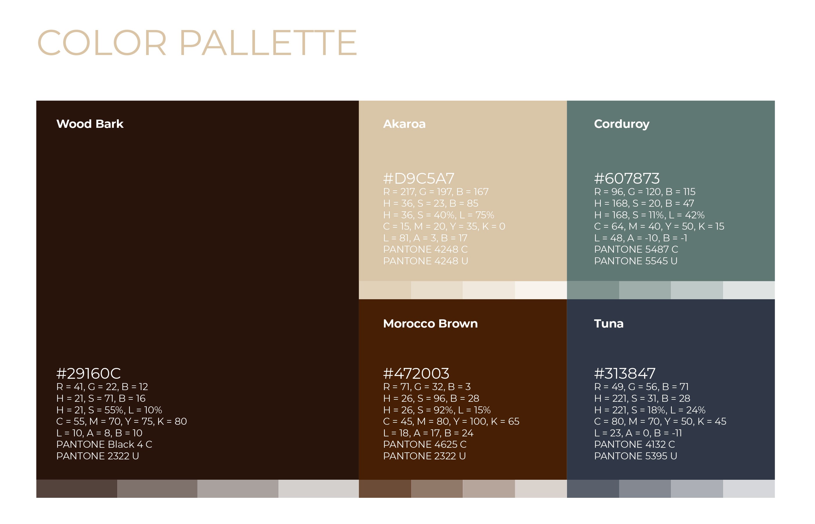
The deliverable of this project was a complete brand guidelines manual along with a range of marketing materials supporting the company’s communication, such as billboards, posters, and a website. A spectrum of brown tones derived from the wood materials most frequently used by the company was chosen as the primary color palette.
Another interesting recent project was the design of a comprehensive brand identity for a premium furniture retailer based in Minnesota. The identity is built around a custom FM pictogram that evokes elegance and warmth – its clean geometric construction with finely crafted details reflects the brand's positioning at the intersection of quality craftsmanship and affordable luxury.
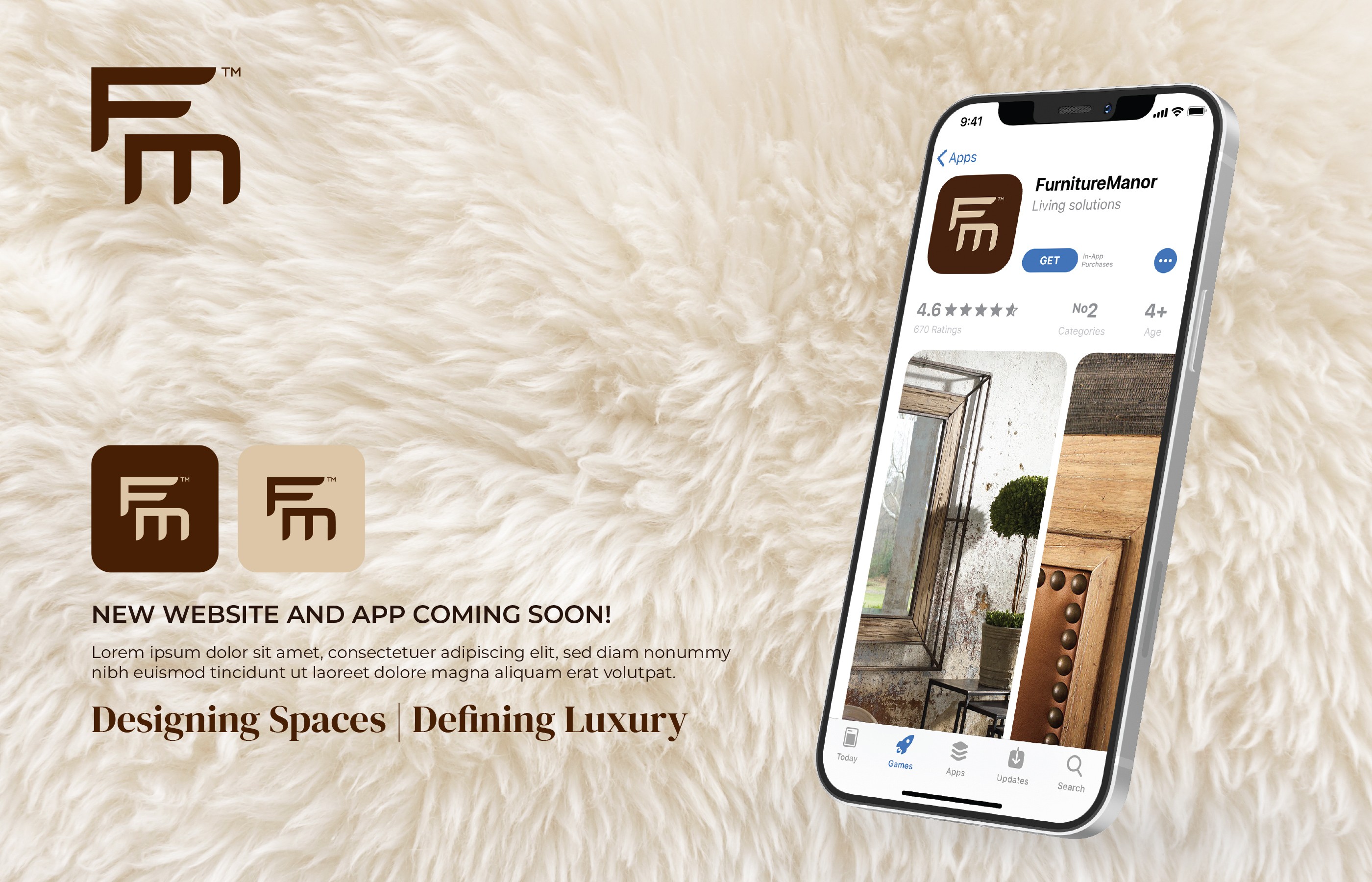
The deliverable of this project was a complete brand guidelines manual along with a range of marketing materials supporting the company’s communication, such as billboards, posters, and a website. A spectrum of brown tones derived from the wood materials most frequently used by the company was chosen as the primary color palette.
Another interesting recent project was the design of a comprehensive brand identity for a premium furniture retailer based in Minnesota. The identity is built around a custom FM pictogram that evokes elegance and warmth – its clean geometric construction with finely crafted details reflects the brand's positioning at the intersection of quality craftsmanship and affordable luxury.
The deliverable of this project was a complete brand guidelines manual along with a range of marketing materials supporting the company’s communication, such as billboards, posters, and a website. A spectrum of brown tones derived from the wood materials most frequently used by the company was chosen as the primary color palette.